Simple
Project Tracking Approach
Puts You in Control of Your Project

Doug Putnam
QSM Vice President
The Measurement
Challenge
One of the keys to successful
project execution is a practical measurement, tracking,
and forecasting framework. The framework needs to provide
early warning so that leaders can better understand
what’s happening on their project and take appropriate
actions.
Everyone on the project
must be committed to and participate in the collection
of an adequate set of measurement data; however, there’s
a delicate balance between having enough information
and drowning the developers with overwhelming data
requirements. The challenge is to find the right balance
where everyone benefits.
A Monitoring Method
Rate charting is a technique
that has been around for some time. The concept, implementation
and interpretation of rate charting is straight forward.
So what do you need to
construct a rate chart? You need to be able to measure
the product or the process as a function of time. You
need to identify a start date and a completion date
and the rate of completion. Figure one is an example
of typical rate chart.
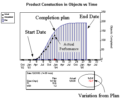
Figure 1. Typical Rate Chart
- Objects completed vs Time.
This example shows the
construction of objects over time. The blue bars represent
the objects that should be complete on a particular
date. The black squares represent the actual number
of objects that are complete. If the actuals are above
the line your ahead of schedule. If they are below
the line (as the example shows) you are behind.
Control Bounds -
An Effective Method to Monitor Variation
You shouldn’t expect
to be on the plan exactly as you proceed but when should
you get concerned when you drift away from the plan?
Statistical control bounds, which identify acceptable
and unacceptable limits of variation, might be a good
way to proceed.
Figure 2 builds on Figure
1 by adding green and yellow control bounds. The green
zone would be viewed as acceptable variation. The variation
might be caused by any number of reasons but as long
as it maintains a green position then there is an excellent
chance that the overall schedule will not be affected.
The yellow zone on the
other hand is unacceptable variation from plan. Investigation
is desirable when the data drifts into this zone. It
might turn out that no action is required, but if some
action is required it is better to discover problems
early and take action. By taking action early you increase
the probability that your action will have a positive
influence on the outcome.
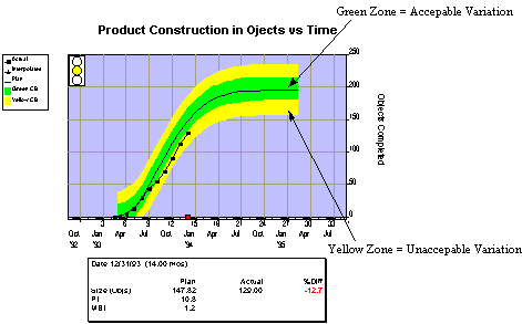
Figure 2. Statistical Control
Bounds show when actuals are beyond acceptable variation
boundaries.
Packaging Multiple
Indicators to Add Information
No single indicator tells
the entire story. Wall street analysts typically use
many different financial ratios (Price/Earnings, Debt/
Equity, etc.) to help analyze a company’s health.
Taken together, the metrics provide a more complete
picture of an organization and help portfolio managers
make more informed investment decisions.
Why not apply the same
thinking to our software management indicators. As
a minimum, software development leaders need to assess
the following areas:
- Project Cost
- Project Schedule
- Product Construction
- Product Quality and
Reliability
Edward Tufte (author and
world renown authority on display of graphical information)
points out that it is much more effective to display
related information adjacent or "within eye span" rather
than to stack it serially in time. So designing an
effective display of information becomes as important
as the information itself.
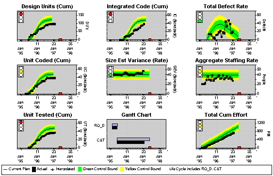
Figure 3. Sample software indicator
panel.
Figure 3 is a sample project
indicator panel. It contains 9 graphical elements.
The specific position of each graph is designed to
assist in understanding the data and comparing it to
other related information. For example, the left most
column of vertical graphs are related to product construction.
Design components are on top. Positioned below it and
following design is software coding. On the bottom
is code that has been through unit testing which follows
the coding. All three product construction indicators
are telling the same story - product construction is
behind schedule. The staffing and effort graphs in
the right most column show that the project has been
under staffed from the beginning - a possible reason
for the slippage. Additionally, you notice that there
has been a increase in the discovery of defects during
the last 6 months. During that time approximately half
of the product was being integrated which is typically
the point when a system is the most unstable. You also
notice that as the problems were being fixed no new
progress was being made in design or coding. As you
can see it is much easier to correlate what’s
going on when we analyze the data in parallel.
Forecasting Potential
Outcomes
Given that a project is
off target, it is possible to generate a curve fit
forecast from the actual data and predict what is likely
to happen. Figure 4 shows a typical forecast to complete
based on the curve fit approach. This forecast assumes
that the project maintains the current staffing however,
it is possible to look at other tactical scenarios;
e.g., what if we increase the staffing or what if we
reduce the functional content. These forecasts can
help us make informed decisions about how to proceed.
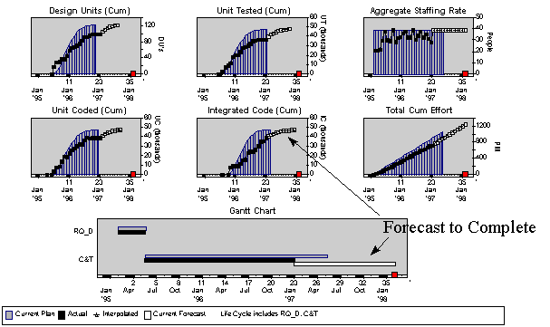
Figure 4. Forecast to complete.
Summary
Don’t expect the indicator
panel to solve all of your problems. It is a tool that,
used in the proper context, can provide significant
insight into your development process. We find that
the indicator panel is an effective technique because
it yields a maximum of useful information with a minimun
of overhead. It's really a routine wellness check for
your project.
Sometimes the indicator
panel will highlight conflicting information which
needs to be examined more carefully; however, it should
put you in a position to spot trends quickly. You can
then ask appropriate questions of your people and take
effective actions to ensure that you can still honor
your commitments. Try the rate chart concept along
with the multiple indicator panel. I think you will
find that it takes some of the risk out of a risky
business.