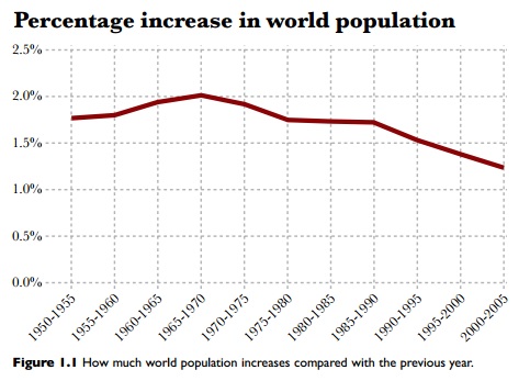
In his book, The Functional Art, Alberto Cairo sets out to explain what data visualizations are, why it is significant to pair data and design, and how to assess whether a data visualization is "good" or not. In the first chapter, Cairo presents an example from Matt Ridley's book, The Rational Optimist: How Prosperity Evolves. Ridley asserted that the global population was decreasing over time, using only one line chart.

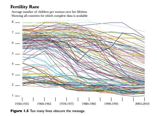
Cairo was uncomfortable with that assertion, so he used the UN and World Bank data for fertility rates (the average number of children born to a women in each country) to create a graph that used individual country population data instead of using aggregate data. The chart below shows all the fertility rates for every country over time.

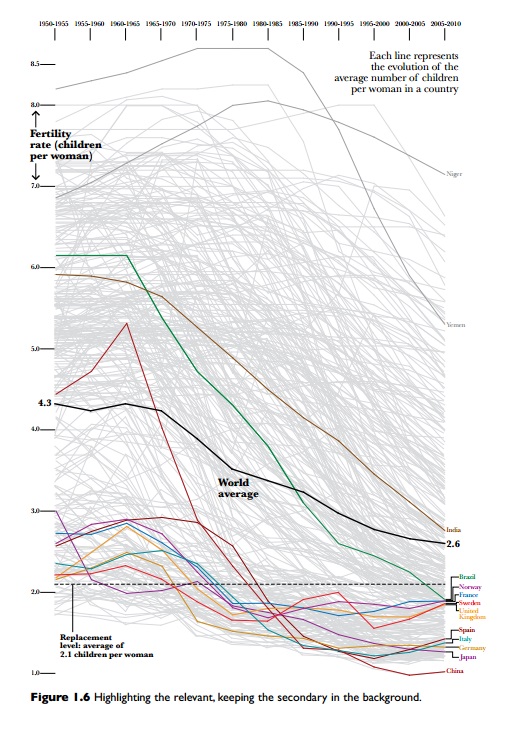
There are so many stories in the data that it's overwhelming, so Cairo created the following graphic which highlights just a few countries in order to pull out the story within the data:

Although the graphic above contains all of the world fertility data, it is much easier to tease out the story, or stories. Roughly 25% of countries have lower than the world average fertility rate. Niger has the highest fertility rate of any other country, but has been declining since 1985. India's fertility rate has been sharply declining since 1970 and is just above the world average. So many individual stories make up the world average and it is important to keep that in mind. The world average is not a monolithic number, but rather a lot of numbers put together.
When Cairo critiqued Ridley's graphic, one line struck me, "the fact that the graphic is an aggregate of the data of all countries in the world impedes our ability to see the multiple patterns Ridley discusses. (7)" This is kind of like using all of the data in your database for benchmarking; there's simply too many stories in that amount of data and the story you do get is going to be muddled.

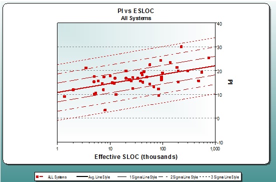
The scatter plot for PI vs. SLOC above shows a database of 50 projects with a median PI of 16.52. You could use this entire database to benchmark for your organization, but adding a few simple query conditions allows you to stratify the database and gain insight into factors that may be driving productivity.
To stratify the database, I created separate queries to pull out individual organizations individually and segregate the database by application type:
| Query | Median PI | Sample Size |
| App Type=Business | 16.78 | 37 |
| Organization=Global Energy | 16.29 | 9 |
| Organization=Binary Systems | 15.25 | 10 |
| Organization=High Street Financial | 15.70 | 4 |
| Organization=National Banking | 19.11 | 13 |
| App Type=Telecom | 14.66 | 13 |
| Organization=Telecom Gen | 13.21 | 7 |
| Organization=FiberTel | 17.26 | 7 |
As it turns out, two different application types existed in the database. Since application complexity is a major influence on productivity, it’s important to use only apples-to-apples comparisons when benchmarking. In the table above, you can see that benchmarking by application type or by organization provides far more information than the high level, aggregated database can deliver. High Street Financial only has 4 completed projects, so it might be a good idea for that organization to use export a database that only contains Business projects. National Banking might want to only use their own projects for benchmarking (or for historic data to load into SLIM-Estimate or SLIM-Control) because their PI‘s are significantly higher than those in the general Business data set.
The key to successful use of your historic data is to tease out only the projects that make sense for what you wish to accomplish. If you want to benchmark your Agile project, it makes sense to only use Agile projects, not all the projects in your database. As you focus your query conditions, you will be able to find the real "story" in your data and eliminate much of the noise.
