We should always allow some time to elapse, for time discloses the truth.
- Seneca
In software development, questions about time are everywhere we look. Can we deliver the features our client needs in 6 months? Is our project falling behind schedule? Would adding four developers get us back on track? How many stories can we fit into the next sprint? Coding is done, but we’re still finding too many defects; how long will it take to get to release quality? Because our focus is firmly on what we’re doing now – on this project or that deadline – it’s easy to lose sight of the big picture.
This study provides a long-term perspective using data from software projects completed and put into production between January of 1980 and the present day. We’ll look at how a typical project from the 1980s compares to today’s projects and analyze trends in size, schedule, effort and team size, and productivity over the last forty-five years.
The QSM Database
Since 1978, Quantitative Software Management has helped clients all over the world collect software performance metrics and use them to power data-driven estimates, performance-based tracking and forecasting, and closeout benchmarks against relevant statistics and trends. Our database of 14,400+ completed software projects is one of the largest and most comprehensive in existence. We use data collected over 45 years to align our products and services with the latest tools and methods, analyze tradeoffs between size, schedule, effort, and quality, and deliver time-tested insights as our clients adopt new technologies and methods.
Our core metric set includes delivered application size, productivity, and defects, along with time and effort for four high-level lifecycle phases (Concept Definition, Requirements & Design, Build & Test, and Post-Implementation Support).
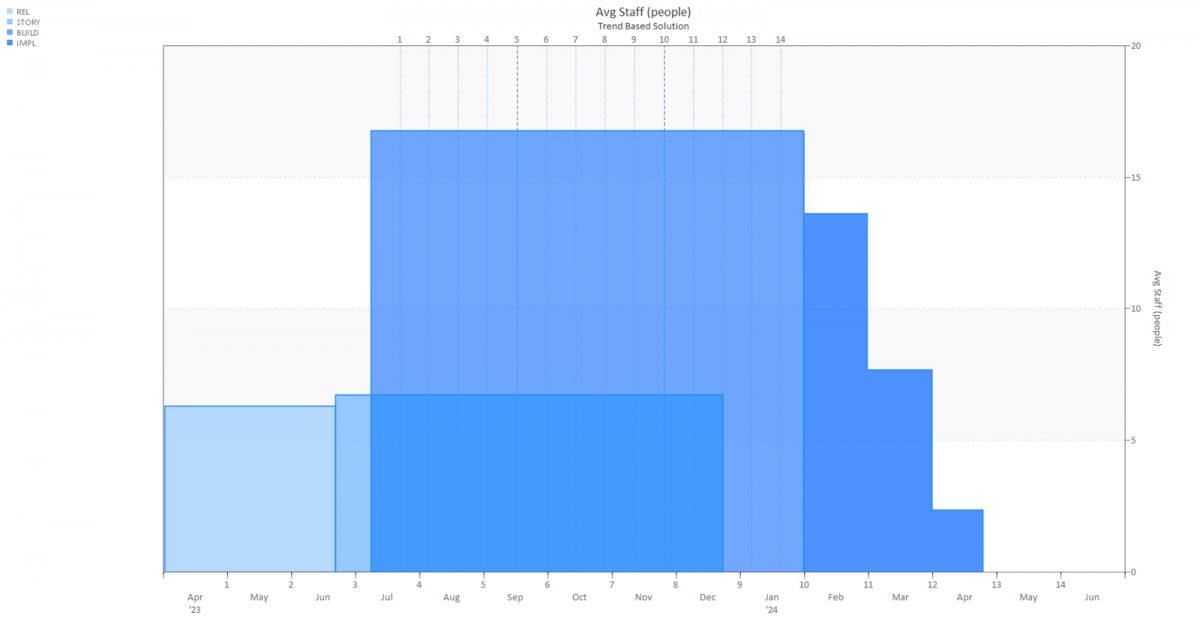
Figure 1: Estimate of a large hybrid Agile project including all four lifecycle phases.
Collecting schedule and effort data by phase prevents misleading comparisons between projects that include different activities. Virtually all (99.9%) projects in our database report time and effort data for the Build & Test phase, while 72% provide time/effort data for both the Requirements & Design and Build & Test phases. By contrast, only 37% of projects report Concept Definition and Post-Implementation data. Delivered size data is recorded for 97% of projects in our database, with defect data reported by 44% of projects.
Software projects in the QSM Database are typically classified into nine application types ranging from Real Time (most complex) to Telecommunications and System Software (medium complexity) to Business IT applications (least complex). The scatterplot chart below shows average Productivity for completed projects in our database as the volume of delivered code increases. To highlight the influence of complexity on development productivity, projects are divided into three “supergroups”: IT, Engineering, and Real Time systems.
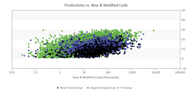
Figure 2: Productivity vs. Size for Three Application Complexity Groups
Real Time Group projects (black dots) are the most complex and typically exhibit the lowest average productivity at each size point. Engineering Group projects (purple) position in the middle, and IT systems (green) exhibit the highest productivity.
Benchmark Metrics
This long-term trend study focuses on a robust sample of over 10,000 Business (IT) projects completed and put into production between 1980 and the present day. Projects in the Business domain automate well-understood IT functions like payroll, human resources, finance, order entry, inventory and records management, materials handling, warranty, and maintenance products. In the 1980s, such systems ran on mainframes and were updated via batch processing. The 1990s saw IT systems move to standalone computers, client-server architectures, and early web-based platforms. Increasingly, modern systems are migrating to the cloud and feature front-end (client-side) and back-end (cloud computing) architectures, services, and scaled resources. Though the functions performed by IT systems have remained relatively constant over time, evolving platforms, data processing and communication requirements, and the demand for integration of multiple systems have changed, increasing architectural complexity.
Though our database captures performance metrics across the entire software lifecycle, this study focuses on schedule and effort data from the start of Requirements & Design (R&D) through the end of Build & Test (B&T) when the system is deployed. Effort hours include all skilled labor needed to produce a viable release: requirements analysis, high-level and detailed design, coding, integration, testing, certification, documentation, and project management. QSM’s productivity metric (the Productivity Index or PI) focuses on development productivity, incorporating time and effort for Build & Test activities (detailed design, coding, testing, documentation, project-level management, and work required to release the product into production).
Sample Demographics
Our long-term trends sample contains:
- Over 10,000 IT projects completed and put into production since 1980.
- Over 1.2 billion total source lines of code (SLOC).
- Just under 10 million total function points.
- Over 250 million person-hours of effort.
- 600+ programming languages.
Software projects can be classified in many ways, but QSM has found application domain, completion year, country of origin, project type/function, development class, size, technology (language), and industry to be the most useful and relevant to our clients.
Decade of Completion
Grouping projects by the decade they were released into production is a useful way to visualize changes in performance, size, and other project characteristics over time. Over the last four decades, institutional support for metrics collection and analysis has ebbed and flowed. During the early 1980s, software metrics analysis was in its infancy and standards needed to support rigorous data collection were not widely used. By 1986, the SEI’s Capability Maturity Model (CMM) provided an early framework for assessing the ability of government contractors to deliver functioning software projects. The CMM defined five levels of process maturity (Initial, Repeatable, Defined, Managing, Optimized) development organizations could use to drive continuous process improvement. CMM adoption promoted formal metrics collection and process improvement during the 1990’s, only to lose momentum with the introduction of more “process light” methodologies like Agile.
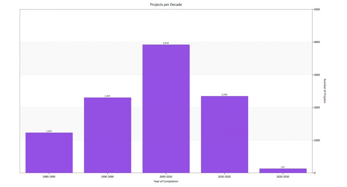
Figure 3. Projects by Decade Completed
The chart above shows total projects from our IT sample completed during each ten-year period. Note the “bump” in the 2000-2010 timeframe. It reflects the time required for project execution and closeout, metrics collection, recording, and validation. The first round of this activity (project closeout) is performed by the contributing organization. Final schedule, effort, sizing, and defect data are recorded and validated. If the company has a strong metrics program, benchmarking against internal or QSM industry performance trends may take place. The second stage occurs when clients contribute one or more projects to our database. Incoming data is validated a second time by QSM staff, a data quality rating is reviewed or assigned, duplicate records are identified and removed, and qualifying projects are analyzed and added to our database. Typically, QSM accepts 40% of incoming projects per update. Due to the time required for all these activities, projects added during each update contain older as well as newly completed projects, leading to a consistent “bump” in total projects for the next to last time period.
Country of Origin
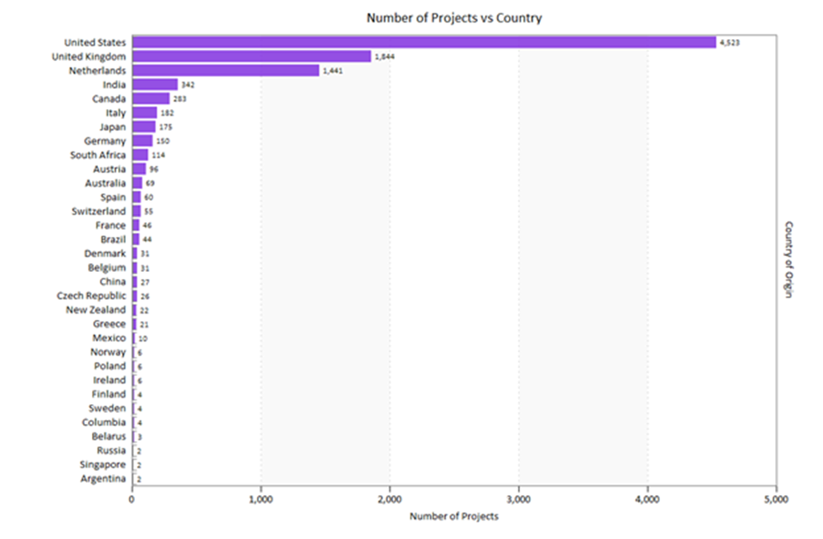
Figure 4. Projects by Country of Origin
Projects in our sample hail from five continents with the majority developed in the United States, the United Kingdom, the Netherlands, India, Canada, Italy, and Japan. The diversity in countries reflects the fact that many QSM clients are global systems integrators operating in multiple regions. Nations contributing only one project (Bolivia, Costa Rica, Turkey, Trinidad and Tobago, Portugal, Puerto Rico, and Hong Kong) are not shown on the chart.
Industry
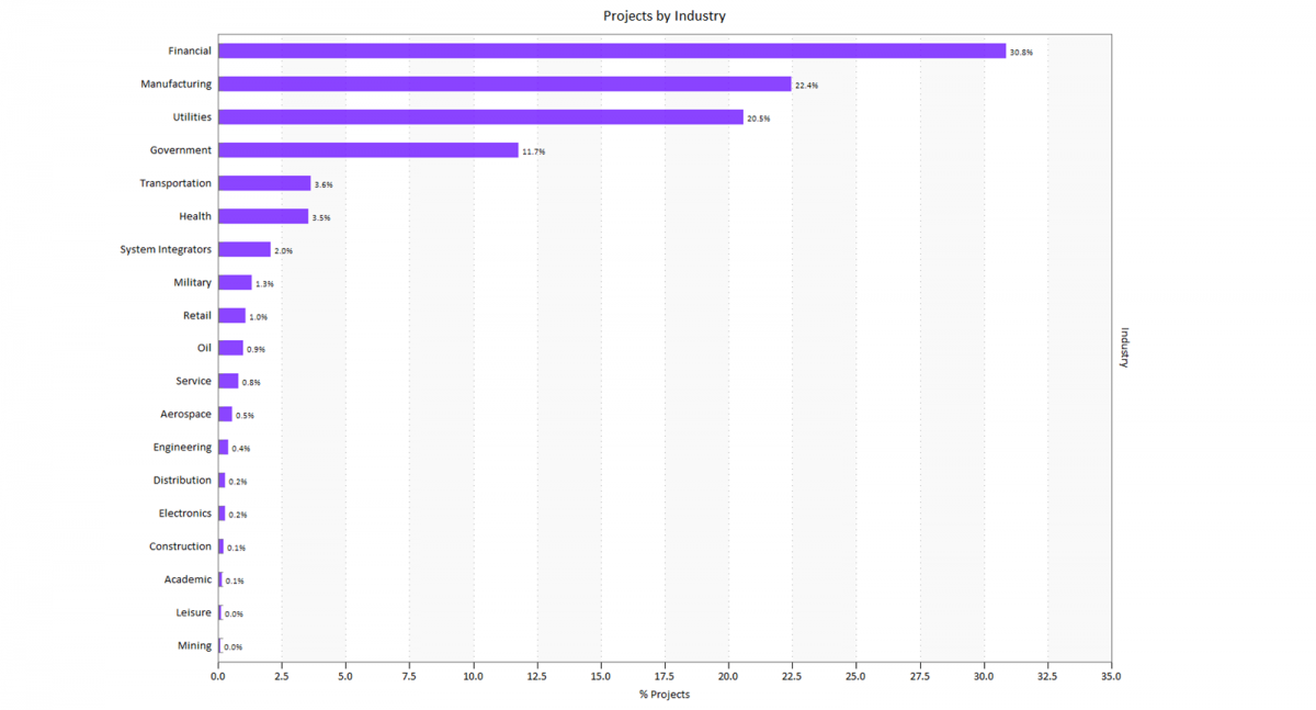
Figure 5. Projects by Industry
Most projects from our IT sample were developed for the Financial, Manufacturing, Utilities, Government, and Transportation industries. Projects with unknown values (14.7% of the sample) are not shown on the chart above. Commonly, IT systems differ more by function than by industry, so the target industry is not a primary influence on productivity. The exception to this general rule can occur in highly regulated areas like finance, government, and health care. For these industry sectors, regulatory overhead associated with changing government regulations, oversight, and development standards can increase time to market and staffing and drive up cost.
Project Type (Function)
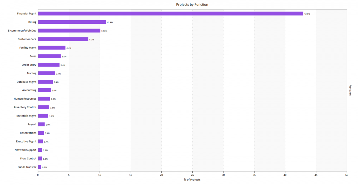
Figure 6. Projects by Type/Function
Stratifying the overall Business sample by functional detail allows useful comparisons between systems that solve similar problems and perform the same jobs. Three quarters of projects in our sample were Financial Management, Billing, E-commerce or Web systems, Customer Care, Facilities Management, and Sales applications.
Development Class
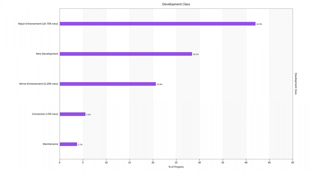
Figure 7. Projects by Development Class
The Development Class metric classifies projects by the percentage of newly developed functionality, relative to modified and/or reused (unmodified) code or functions. When calculating development/process productivity (PI), QSM considers only new and modified code – code requiring work to create or revise for the current release – in the project’s measured size. Unmodified code or functions require no work to create (they already exist) but must be tested along with newly developed or modified code. Analysis is often required to understand this existing code. If this important step is neglected, defects are injected and additional work to diagnose and correct them is required before the product can go live.
Most projects (70%) in our long-term trends sample were either New Developments or Major Enhancements. Minor Enhancements, Conversions, and Maintenance releases were less common, comprising just 30% of the sample.
Programming Languages
Though our clients often expect the programming language to be an important productivity driver, our research has not shown a strong relationship between specific languages or language levels and schedule or effort performance. There are several possible reasons for this:
- Other factors (team size and experience, schedule pressure, application complexity, and even system size) exert a greater influence on performance.
- Many projects are developed in multiple languages, making it difficult to tease out the influence of any single language on project outcomes.
- While using a more powerful language with robust libraries can reduce the amount of new code required to perform various tasks, the learning curve for inexperienced developers can still be significant.

Figure 8. Top Primary Languages
The word cloud above shows the top primary languages for projects completed after 2010. Primary and secondary languages comprise the largest and second-largest percentages, respectively, of the new and modified code delivered per release. The most popular primary language (largest font) is JAVA (31.4%) with COBOL (8%) as a distant second. Java’s share has decreased by nearly 10% from our last study in 2019, with C/.NET languages, PL/1 and SAP/ABAP also moving up. Secondary languages are dominated by Java and SQL variants.

Figure 9. Top Secondary Languages
The “Typical Project” Over Time
What does the average IT project in the QSM database look like, and how has “what’s typical” changed over time? To find out, we looked at the average schedule, effort, team size, new and modified code delivered, productivity, language, and target industry for each decade. Schedule and effort numbers include activities from the Requirements & Design through Build & Test phases.
During the 1980s, the typical software project in our database delivered over 2.5 times more new and modified code, took 2.25 times longer, and required nearly twice as much effort as today’s average or typical projects. Interestingly, team sizes have changed little over the past forty years, with averages ranging from 5.5 to 6.9 FTE staff. The table below summarizes these changes:
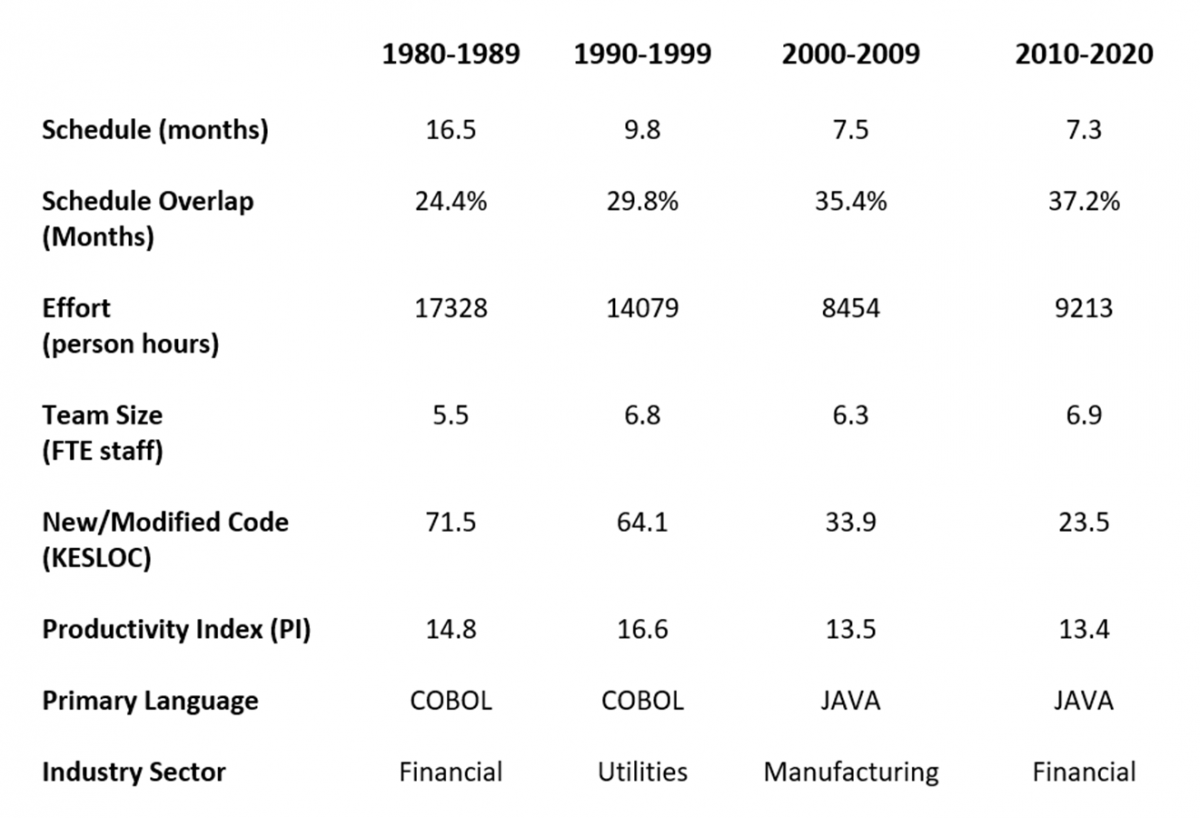
Figure 10. Typical Project Characteristics over Time
- Schedule (months): R&D through B&T schedules decreased dramatically, from a high of 16.5 months in the 1980s to 7+ months after the year 2000.
- Schedule overlap between the R&D and B&T phases has increased steadily, rising from an average of 24.4% in the 1980s to 37.2% from 2010-2020.
- Effort: Average effort hours spent from R&D through B&T started off high in the 1980s but decreased through the 2000s before increasing slightly from 2010 on. Overall, projects are expending less effort in the Requirements & Design through Build and Test phases.
- Team size: Average team size in full-time equivalent (FTE) staff has changed very little over the last four decades. This is a bit surprising considering the dramatic decrease in average and median project sizes. We suspect that project size reduction has been offset by increases in architectural and algorithmic complexity and the move to more frequent releases (schedule pressure). While smaller systems require fewer developers, technical complexity tends to increase the demand for team members with specialized skills and diverse subject matter expertise. Previous time-effort tradeoff studies have also shown that adding staff to compress the schedule only works for smaller projects. For large projects, it drives cost up, dramatically worsens quality, and delivers little or no schedule compression. It’s quite possible that today’s smaller projects can reduce time to market using slightly larger teams precisely because they are managing scope.
- New & Modified Code (Size): From the 1980s to the present, average new and modified delivered code volume was reduced by about 67%. Later in this paper, we’ll explore this size reduction in more detail.
- Primary Language: COBOL was the dominant programming language for projects put into production during the 80s and 90s. After 2000, JAVA eclipsed COBOL and continues to be the most frequently used primary language. People are often surprised at the enduring presence of COBOL, but most recent COBOL projects in our database represent maintenance releases of large legacy systems rather than new developments.
- Industry Sector: The target industry for which projects were developed has come full circle from Financial sector (banking and insurance) projects dominating the ‘80s to Utilities (Telecom) and Manufacturing (Computers) in the ‘90s and ‘00s, returning to the Financial sector after 2010. Shifts to the target industry/sector are often driven by changes to government regulation and spending. Notably, the recent increase in insurance and medical records systems reflects Affordable Care Act legislation and funding.
Application Size Over Time
Our research shows a consistently strong correlation between the new and modified code built, tested, and delivered per release and management metrics like duration, effort, defects, and productivity. In all cases, as delivered code goes up, so do average duration, effort hours expended, pre-release defects found, and development productivity.
This positive correlation makes intuitive sense: as the number of features goes up, we expect– on average –projects will take longer to complete, require more effort, and produce more defects. The positive relationship between size and productivity is less intuitive, but is consistent regardless of the productivity metric (QSM’s PI, effort per line of code or function point, code or function points per development month) used. Project complexity, team experience, schedule and cost constraints, staffing strategy, and other environmental factors all influence performance, but over thousands of projects the volume of delivered code is consistently proportional to the work required to create or modify it.
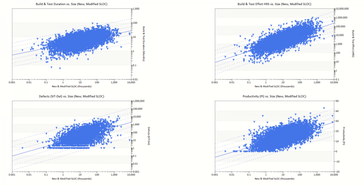
Figure 11. Major Management Metrics vs. Delivered Size
The average size (in new and modified code) of software projects decreased by about 67% from the early 1980s to 2010-2020. But while the average is a useful measure of central tendency, it can be influenced by very large or very small data values. This is particularly true with application size data, which can be skewed by just a few very large projects.
Compared to the averages shown in the top chart in Figure 12, the median (or “middle” value, with half the data above and half below it) size values shown in the bottom chart demonstrate the trend toward smaller projects more clearly. In the early 1980s, median new and modified code delivered was over four times larger than median project sizes for systems completed after 2000. The latest data suggests the trend towards smaller, more compact projects may be slowing; the median size for projects completed in the 2000-2010 time period is very close to projects completed after 2010.
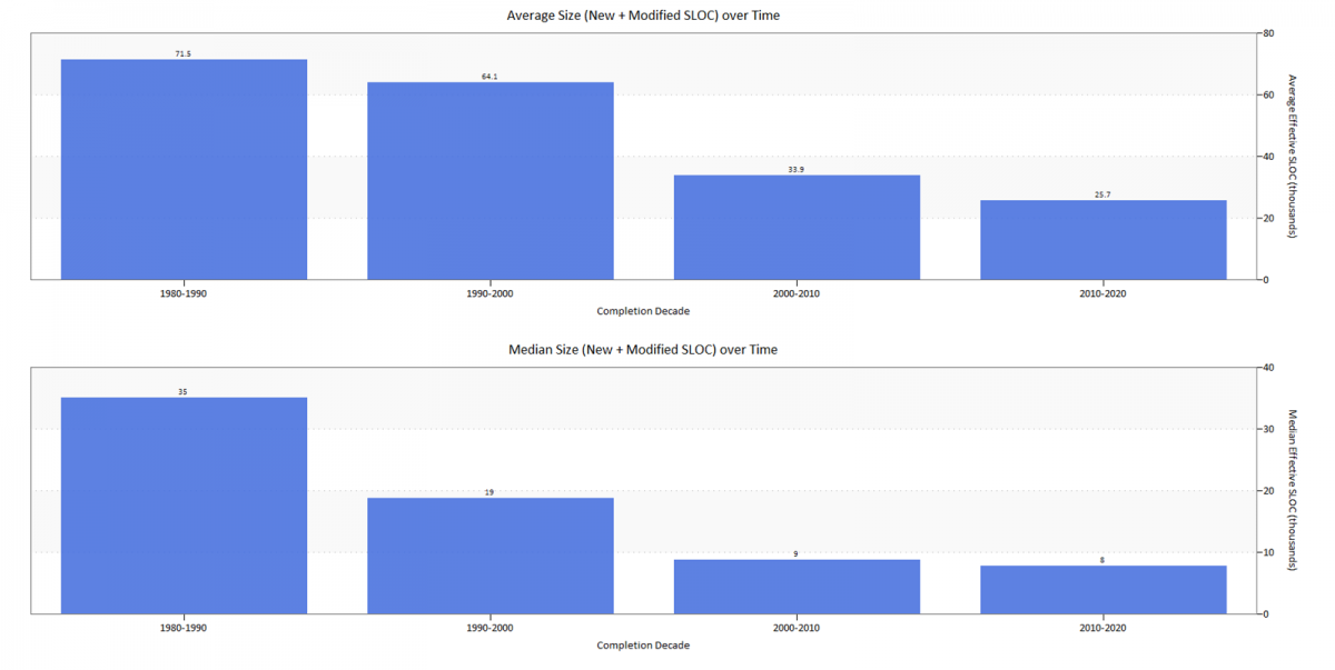
Figure 12. Average and Median New and Modified Size over Time
The scatterplot chart below provides more detailed insight into the decline in project sizes. The round, square, and triangular symbols represent individual projects delivered during each decade. The grey average trend line tracks average reduction in system size over time. In earlier long-term trends studies, we noted that the range of observed system sizes was increasing, with the greatest variability occurring from 2000 to 2010. That decade still shows the most variation.
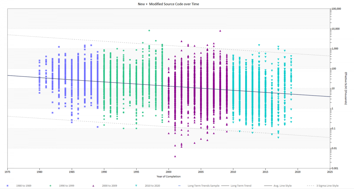
Figure 13. Distribution of Project Sizes (New and modified source lines of code) over time
To get a little more insight into the decline in average project sizes, the next chart shows that this size reduction is driven by:
- Fewer large projects (over 500,000 new and modified lines of code) released after the year 2000, and
- More small releases (projects outside the lower end of the blue outline) completed after the year 2000.
The two decades before the year 2000 appear offset from the two decades after, with project sizes shifting visibly downward. Possibly this downward shift reflects a painful course correction after the jump in large project failures during Y2K remediation.
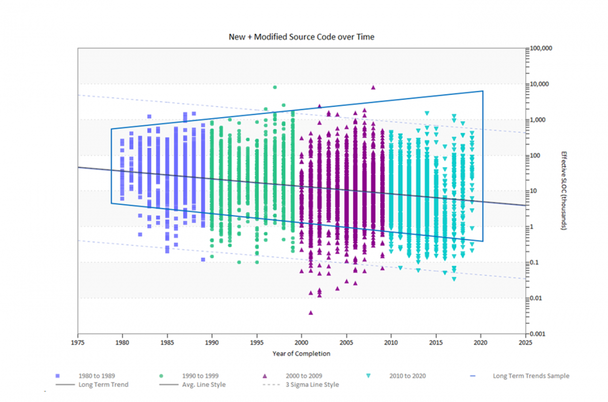
Figure 14. Project Sizes (New and Modified source lines of code) over time, average and range highlighted
Wait! Are Projects Really “Shrinking”?
We’ve seen that the average software release today delivers about 33% as much code (measured as new and modified logical lines of code) as an average project from 40 years ago. The median size reduction of 75% is even more dramatic! But what does this mean in real terms? We know modern projects often use more powerful programming languages that require fewer executable statements to accomplish the same amount of work. Is there a way to look at delivered functionality that gets around the move from verbose, procedural languages to more concise object-oriented and modular ones?
Function points, a requirements-based size measure that expresses system size in terms of interfaces and functionality provided to end users, provide just such a way. Fortunately, function points are the second most-used size unit in the QSM database so we have ample data to work with. Let’s look at how system size – captured via a size measure counted independently from the lines of code required to implement each feature – has changed over time.
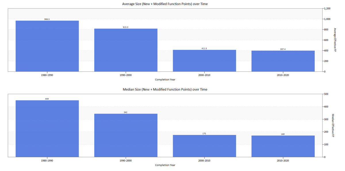
Figure 15. Average and Median New and Modified Function Points over time
Average and median function points (FP) delivered per decade show the same steep reduction in system size observed with logical lines of code. The decrease in Function Point project sizes is less extreme, but still pronounced. Average Function Points delivered in the last decade declined by 59% (as opposed to 67% for code) from the average system size delivered in the 1980s. Median FP declined by a similar but smaller amount (62% for FP, compared to 75% for code).
The detailed scatterplot view shows the same decrease in delivered FP per project over time, but the decline in large systems and increase in small ones after 2000 is not as striking as when size is expressed in new and modified lines of code.
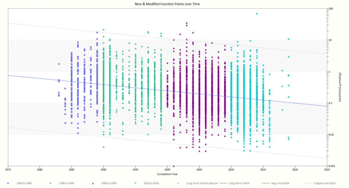
Figure 16. New and Modified Function Points over Time
Clearly, programming language power alone cannot explain the percentage reduction in system sizes over time: the results for code and function points are too similar! What is driving the steep and sustained decline in delivered functionality? The trend towards smaller projects most likely reflects a combination of factors:
- Unmodified/reused code. Whether it takes the form of open source code, frameworks, reused/legacy code from existing applications, or generated code, reuse comprises a significant portion of delivered software systems. Since the charts in this section show only new and modified functionality delivered during each time period, reuse is not reflected in the numbers. Fewer projects are choosing to report how much unmodified code is incorporated into project releases, making comparisons of unmodified code over time more challenging.
- Newer lifecycle methodologies like Agile, RUP, and incremental builds aim to limit scope creep by allotting smaller groups of features to predefined time boxes, sprints, or iterations.
- Measurement inefficiency. Well established and defined sizing techniques like function points require trained practitioners and can be expensive to count but - like lines of code - don’t always capture all the work required to deliver the product. Techniques like SNAP[1] are designed to account for this kind of nonfunctional work. Early, design-based size measures like requirements, stories, and use cases may be defined at too high a level to fully capture scope creep as the design evolves. Finally, GUI-based configuration work needed to customize COTS or SaaS products can be hard to capture in a rigorous and consistent way.
- More efficient programming languages and methods. As technologies and development environments continue to evolve, each line of code delivers more “bang for the buck” per statement in terms of functionality. Though system sizes have clearly declined for projects measured in both lines of code and function points, more efficient programming languages may still account for a small part of the greater rate of size reduction over time for systems developed in lines of code.
Development Class Over Time
About 58% of the projects in our long-term trends sample provided development class information. Development classification describes the type of development effort undertaken by the project:
- New Development: 75% of the system is new functionality.
- Major Enhancement: 25 to 75% of the system is new functionality.
- Minor Enhancement: 5 to 25% of the system is new functionality.
- Conversion: < 5% of the system is new functionality
- Maintenance
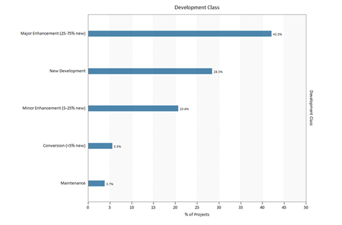
Figure 17. Percentage of Projects by Development Class
About two thirds of the projects that provided data for this metric were Major or Minor Enhancements of existing systems. Under one third were New Developments.
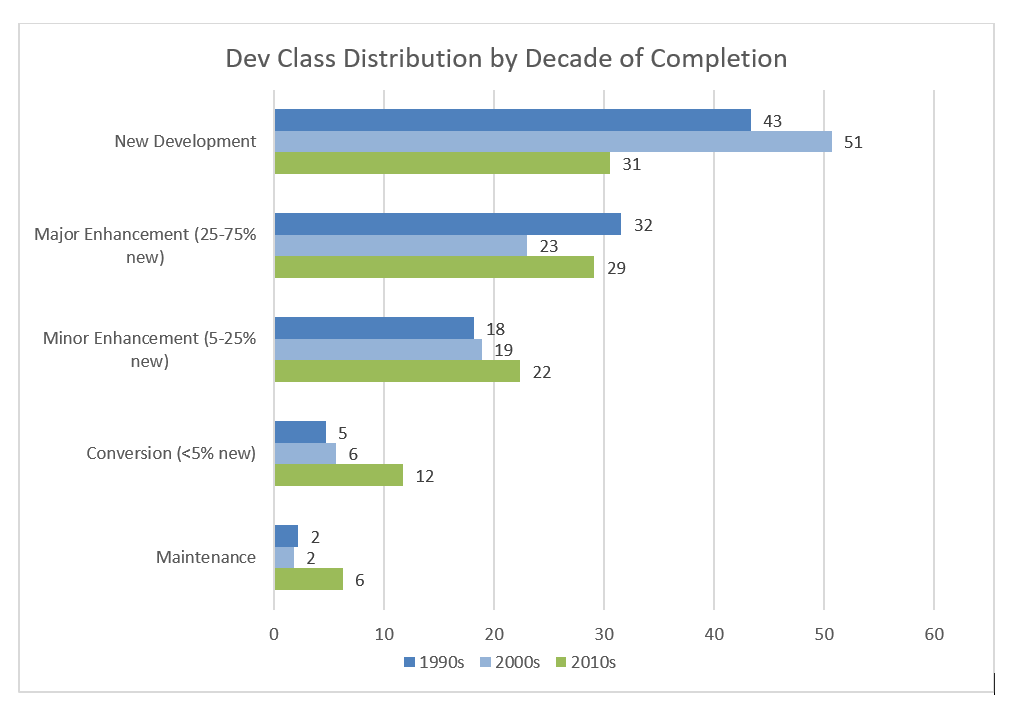
Figure 18. Development Class Distribution over Time
The bar chart above shows how the proportion of projects in each development class has changed over the last two decades:
- New developments have decreased by 12% since the 1990s after increasing in the 2000-2010 timeframe. Data was not available for earlier time periods.
- Major Enhancements decreased during the 2000s but rebounded in the 2010s.
- Minor Enhancements increased only slightly (from 18-22%) over the last three decades.
- In the early 1990s, enhancements to existing systems (major and minor enhancements combined) outnumbered new development by 7%. By the latest decade, enhancements outpaced new developments by 20%.
- Though they comprise the smallest percentages in the sample, Conversions and Maintenance releases have increased sharply since 2009. Conversions are more than double the 1990s percentage and Maintenance releases are three times what they were in the 1990s.
Schedule Performance Over Time
In the early 1980s, the average software project took over a year to develop. Since 2000, most software development projects have been completed in the 7 to 8-month range. Median schedules show the same downward trend, with the rate of decrease slowing in the last two decades.
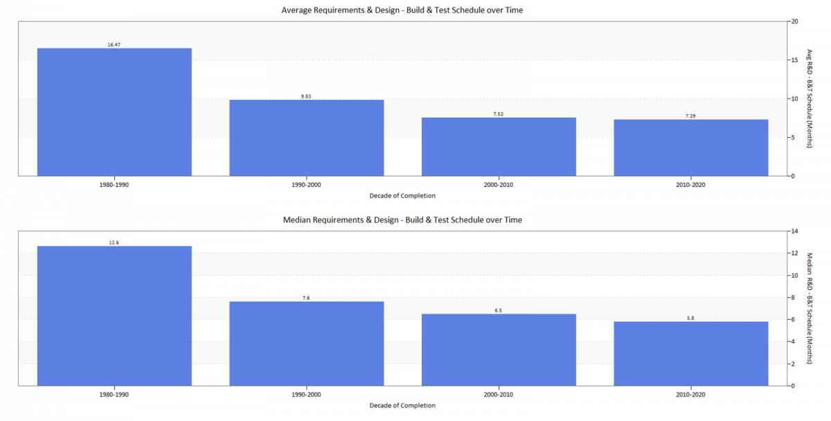
Figure 19. Average and Median Requirements-Build & Test Schedule in Months
The individual data points shown in the scatter plot below provide additional insight into the range of schedule outcomes for individual projects. Overall, the duration trend over time (shown by the blue average regression line) shows a marked reduction in average project schedules. Note that the trend would slope downward even without the steep decline in projects with longer durations (both over 40 months and 20-40 months, above and within the grey shaded region) after 1990.
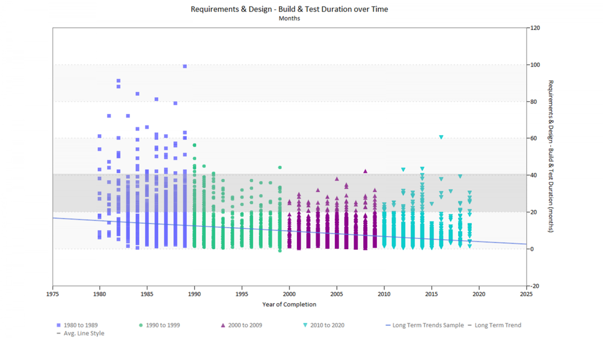
Figure 20. Requirements & Design-Build & Test Schedule over Time
Several factors are likely driving decreasing project schedules:
- Project sizes, measured in new and modified code developed for each release, have declined markedly while team sizes increased slightly.
- The decline in larger projects is augmented by a corresponding increase in the proportion of smaller, shorter projects (10,000 ESLOC or less) completed during each decade.
- Average overlap between the Requirements & Design and Build & Test phases increased from 24.4% in the 1980s to 37.2% from 2010-2020.
- The rise of Agile, Dev Ops, and iterative development methods encourages packaging functionality into smaller, more focused releases.
Effort Performance Over Time
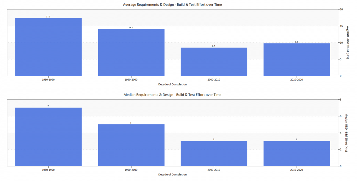
Figure 21. Average Requirements-Build & Test Effort Hours over Time
The bar chart above shows average and median effort over the last four decades. Effort expenditure is influenced by project size, schedule, team size, productivity, and indirectly, quality. Since the 1980s, average project sizes have decreased by two thirds, yet schedule and effort have gone down by about half. As we saw in the Typical Project section, team sizes have remained relatively constant.
Effort reduction has not kept pace with the decline in average size. Why is this? Application complexity (both algorithmic and architectural) may require more diverse skill sets and thus, larger teams. More advanced and rigorous methods and practices may allow teams to work together more effectively. Finally, it may simply be that companies trying to meet aggressive time to market goals may be using larger teams than needed in hopes of reducing the schedule. This strategy, as we noted in the schedule section, is most effective with the smaller projects typical after the year 2000.
Development Productivity Over Time
QSM’s Productivity Index (PI) is a measure of the total development environment. It reflects development influences like management strategy, development methods, tools, techniques, developer skill and experience, and application complexity. Values range from .1 to 40, with low PI values associated with inexperienced teams, poor environments and tools, and complex systems. High values reflect robust environments, tools, and management and well-understood, straightforward projects.
Application size is a little known but major productivity driver. This is true regardless of the measure used; ratio-based productivity measures like SLOC or Function Points per effort unit exhibit the same relationship to project size as QSM’s Productivity Index, which considers not only size and effort but time to market as well.
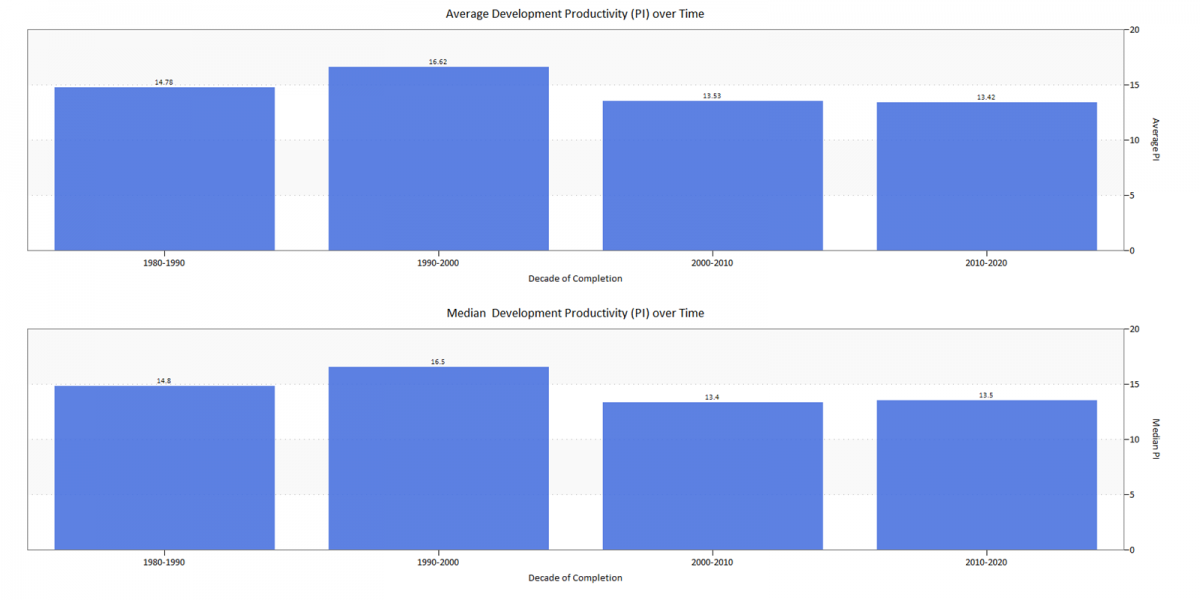
Figure 22. Average and Median Productivity Index (PI) over Time
The bar chart above shows productivity peaking from 1990-2000 and falling after that. In the 2006 QSM Almanac, we speculated that productivity from 1995 to 2000 might be artificially high due to an influx of large Y2K remediation projects with little original design work or new algorithms. Projects from 2000 to 2005 also exhibited lower average productivity than projects from the previous decade. Since the year 2000, productivity has been essentially flat.
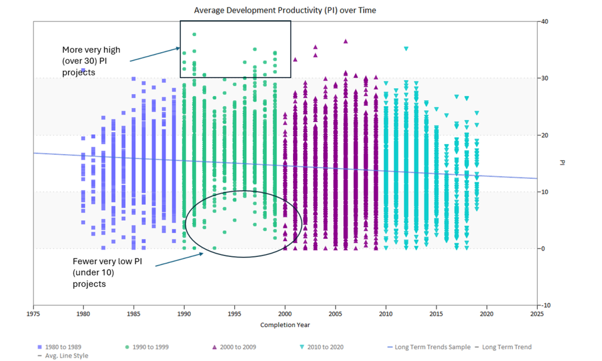
Figure 23. Productivity Index (PI) over Time
The scatter plot above shows productivity indexes for individual projects over time. There are two interesting observations about the distribution of PIs by decade:
- The 1990s had more very high (over 30) PI projects and fewer very low (under 10) PI projects
- From 2000 to the present, there are many more low PI projects. This may reflect the dramatic decline in project sizes (on average, productivity increases with project size) or possibly growing numbers of enhancement and maintenance projects relative to new development.
Software Quality Over Time
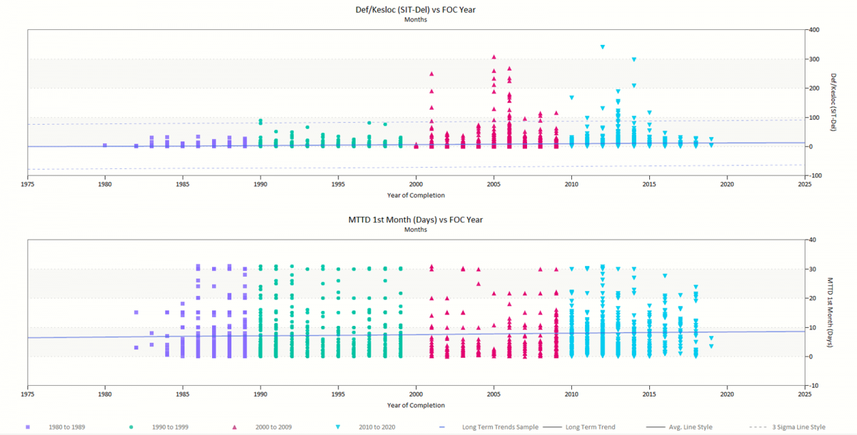
Figure 24: Defect Density and MTTD over Time
A major challenge for many project teams occurs when management focuses on cost (resources) and time to market without considering the negative impact adding staff and decreasing schedule have on quality. To make matters worse, quality measures like defect density don’t tell the whole story. If your current project is finding twice as many defects as you expected, is that a good or a bad thing? It could mean your testers are doing a great job at finding defects that, if undetected, result in a buggy application. Conversely it might mean that too many defects are being injected, but not found before the system goes live. Combining pre-release defects found or defect density with a post-release quality metric like Mean Time to Defect for the first month after delivery tells a more complete tale.
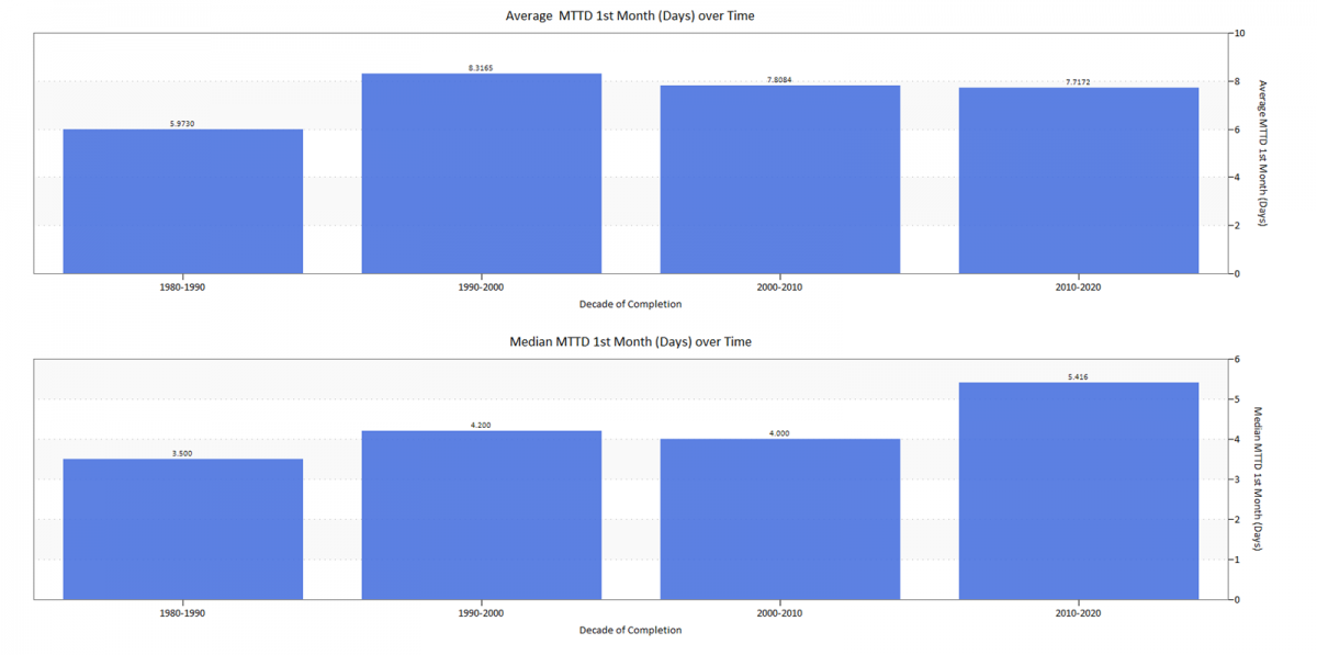
Figure 25. Average and Median MTTD over Time
Looking at both Defect Density (pre-release) and Mean Time to Defect (at release) over time, a few interesting insights appear:
- Defect Density. Projects after the year 2000 (see Figure 23) had higher defect density than projects in the two decades before. Moreover, more projects reported defect data in the last two decades.
- Mean Time to Defect. The overall trend over time for the average time a newly released system runs during the first month in production increased from a median value of 3.5 days in the 1980s to 5.4 days in the last decade. Higher defect density combined with higher MTTD for modern systems suggests that teams are doing a better job of finding (and fixing) defects before the system is released. The payoff is an additional two days of defect-free operation, saving maintenance costs and lowering the number of bug fix releases.
Conclusions
Previous long-term trends studies showed improvement in most IT effectiveness measures over time. The big picture remains the same: average and median values for the major management metrics have come down over time while team sizes have remained essentially flat. What can easily get lost in the numbers is the relative magnitude of these changes. The graphic below shows the median values for each metric over time, relative to the baseline 1980s median value. The last column shows the direction and magnitude of the changes for each metric.
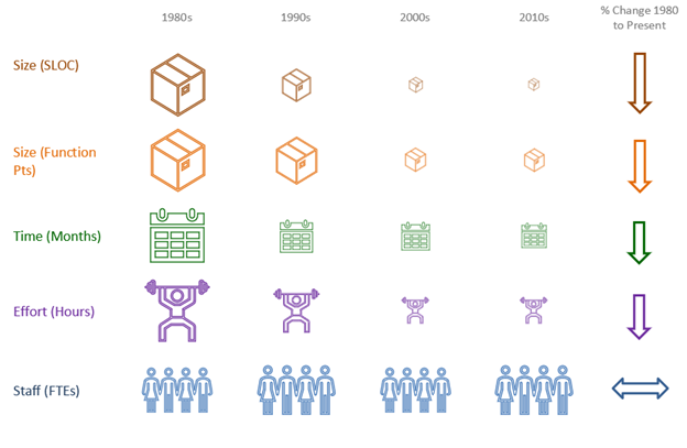
Figure 26. Median Values of Major Management Metrics over Time
Size, measured in Source Lines of Code and Function Points, has decreased the most, followed by schedule and effort. But over the last 20 years, the rate of change has leveled off. At end of our last long-term trends study we speculated that there may be some natural limit, beyond which reductions to the size, effort, and schedules of software projects don’t produce enough benefit to outweigh the added cost and impact to quality. The answer to this question is the same as it was in the 1980s: collect and analyze more data.

