Arithmetic mean (aka average) is often a misleading number. One reason for this is that mean is sensitive to outliers. A very large or a very small value can greatly influence the average. In those situations a better measure of center is the median (the 50th percentile). But there is a second huge pitfall awaiting anyone using average for estimating or benchmarking: software size.
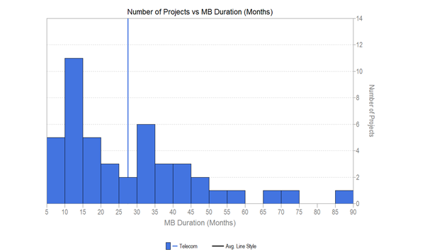
Even though we know that software size has a major influence on the key metrics (e.g., effort, duration, productivity, defects) many people insist on reporting and comparing and using the average value. Let’s look at an example. Consider a sample of 45 completed telecommunications application type projects. Picking one of the key metrics already mentioned, duration of phase 3, we can generate a histogram and calculate the mean. The average duration is 27.5 months. Does this tell us anything useful?

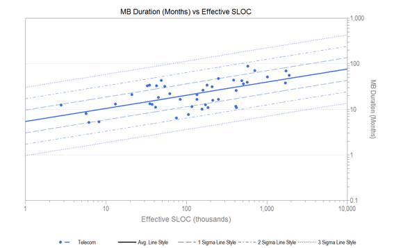
The histogram of durations shows a skewed distribution (many projects have a shorter duration, few have a long duration), so we will need to do some sort of normalization before the average is a measure of center. And even then, what about size? In a typical SLIM scatterplot of duration versus size for these projects, we can see that in general larger projects take longer than smaller ones.

Even though the overall average duration is 27.5 months, a 10,000 SLOC project might be expected to have a duration of 10.5 months, while a 1,000,000 SLOC project about 39 months. Both very far from the “average” indeed!
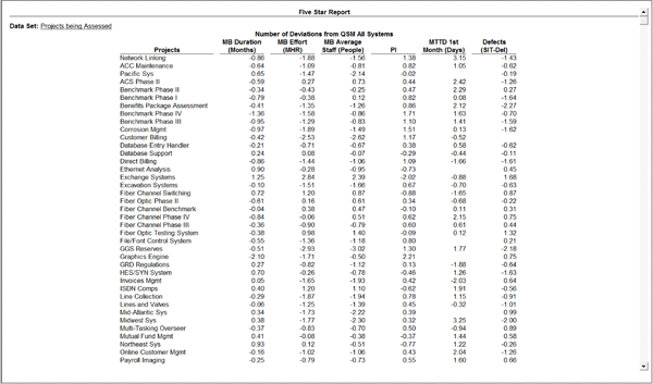
A better way of evaluating an individual project, rather than comparing its duration (or other metric) to the average, would be to compare it to the trendline. This results in a number called a standardized residual. In other words, it is the number of standard deviations the project falls above or below the center line.
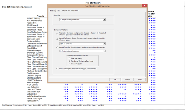
You can obtain the standardized residuals for your data set quite quickly from SLIM-Metrics. There is a check box on the Five Star Report which will output the numbers (rather than the stars). Here is a screenshot of the pop up window for a set of training data.

This will produce the list of normalized factors for the metrics you have selected, which can also be exported to the tool of your choice.

To sum up, most SLIM estimators have used the historical comparison charts to compare estimates or project performance against a historical set of projects and their historical trendlines. This is also very helpful when selecting a PI for an estimate, or doing feasibility analysis.
The standardized factors are very useful when doing benchmarking, such as any time someone is tempted to grab and use an overall average for reporting or estimating. Don’t just use the average, normalize it!
