We live in a multi-dimensional world. We see in three dimensions. Our brains’ ability to process spatial relations of height, width, and depth are essential for navigating everywhere we go and every task we perform. The scientific world has used computers and data to generate 3D graphics for years, because it is the only way to understand complex phenomenon and ideas. I remember the first 3D color seismic map of rock formations underground I saw. The image told a story the numbers alone could not. The business world has caught on in recent years. The wave began with data warehousing and business intelligence and has grown to include data analytics, artificial intelligence, and machine learning.
QSM has brought a scientific approach to software development project estimation and management for over 40 years. Our SLIM-Suite of tools contain statistics on the largest repository of completed software projects that enable you to model software projects to predict potential outcomes and assess the reasonableness of your estimates and project goals. They have always provided four common types of Data Analytics1 – Descriptive, Diagnostic, Predictive, and Prescriptive. SLIM tools now provide more in-depth data analytics using quadrant charts.

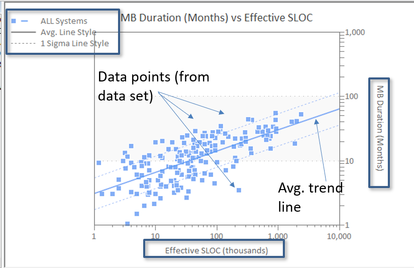
One of the ways SLIM tools help you analyze project risk is through trend variance analysis. This scatter plot shows project schedule (MB Duration) versus scope (Effective SLOC) for a group of historical projects from QSM’s industry database. Trend lines, like the average and +/- 1 sigma lines shown here, are used in SLIM-Suite to identify risky project estimates by measuring the deviation from average, or “typical” performance for core measures of effort, staff, defects, and quality. They are also used to perform performance benchmark analysis on completed projects to identify high performance practices and areas for process improvement.
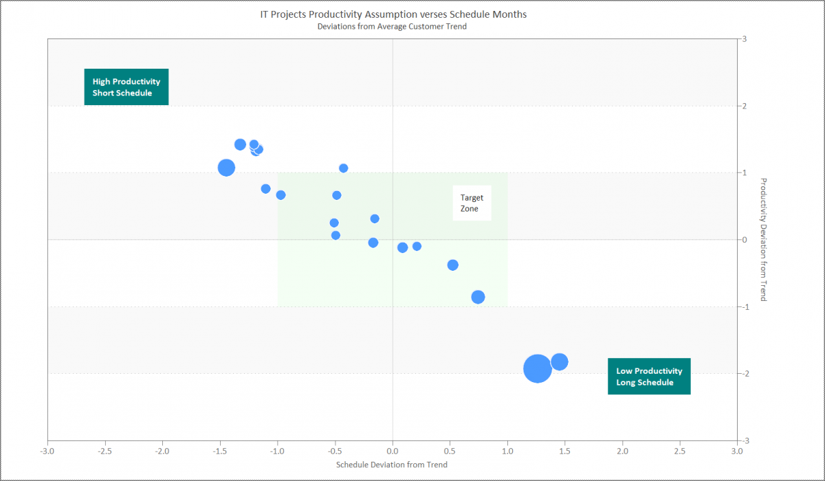
Quadrant charts are bubble charts that add a third and fourth dimension to scatter plots, enabling you to visualize trends and identify actionable insights. The example below shows how quadrant charts are used in project portfolio risk analysis in SLIM-MasterPlan and SLIM-Collaborate. Both axes plot Deviations from Trend – how far proposed schedule, effort, cost, or productivity assumptions vary from average.

The quadrants are defined by the intersection of the average trend line, shown as 0.0 deviation from trend on both axes, plus the min and max for each axis, set to + - 3 standard deviations. In this example, Productivity is charted on the vertical axis and Schedule (Duration) on the horizontal axis. The four quadrants and how they guide the interpretation of data points falling into each quadrant is determined by the combination of metrics you select. Here, the label of High Productivity, Short Schedule in the upper left quadrant helps you rapidly identify projects proposing to deliver in less time than what is typical, operating at a productivity that is higher than what is typical. The risk is that project performance will not achieve these high expectations and there will be schedule overruns. The Target Zone is an area you can define to highlight estimate assumptions considered reasonable – deviations from trend are within an acceptable range, or some other behavior you would like to either promote or discourage. The bubble size in this example is Total (Project) Cost. You can set the bubble metric to Size (scope), Effort, Staffing, Duration, Productivity and Quality.
Let’s look at the project with the highest cost (biggest bubble) in the lower right quadrant. The assumed productivity is approximately 2.0 standard deviations lower than average and the schedule is over 1.0 standard deviations. It is overly conservative. There could be several reasons why this is the case ―perhaps high technical complexity, less experienced personnel. The chart will not tell you, but now you are equipped with data visualization that lets you quickly identify potentially risky scenarios like these that warrant investigation and negotiation that would otherwise go unnoticed.
Two strengths of SLIM’s estimation approach are the ability to:
- Quickly compute several project estimate scenarios to explore a range of potential outcomes.
- Compare estimates to history, either industry or your own, to sanity-check estimates against known capabilities.
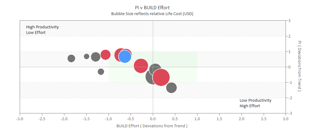
Quadrant charts in SLIM’s estimation tools SLIM-Estimate and SLIM-Collaborate focus on helping you assess the relative risk of each “what-if” scenario, so you can commit to the estimate that balances risk and business goals. Below, is an example of a SLIM-Estimate quadrant chart showing several solutions, along with historical projects from the same organization. As you compute multiple estimate scenarios, you can save them to the solution log. The use of color to represent different data sets provides a sort of 4D effect. The red bubbles are logged estimate solutions, the blue bubble is the current solution (focus of the detailed analysis), and the gray bubbles are completed projects.

The current solution may be a viable one. It is assuming a productivity slightly above average but is within the “low risk” target zone. This organization has demonstrated similar Productivity levels in the past, so it is defensible. The proposed Effort (person hours) is in the middle of the range of past projects. The one logged solution proposing higher effort is, of course the higher cost scenario, as indicated by the bubble size. It would be interesting to create a similar view using Size as the bubble metric and Duration or Avg Staff deviations from trend to gain more insights about specific potential risk areas.
I am excited about the data analysis capabilities now available in SLIM-Suite. Project and portfolio estimation is challenging. Often personal agendas and competing business goals can make it difficult to make objective decisions. SLIM lets the data do all the talking by presenting you with diagnostic, predictive and prescriptive information to support intelligent business decisions across your enterprise.
1. Principa, www.principa.co.za
