Think of a time when you gave a presentation that did not go well. Was the actual content of your presentation subpar, or was it that something lacked in the delivery? More likely than not, your answer was the latter (after all, why would you present something if it wasn’t worthwhile?).
When putting together a presentation, I’ve found that the overall aesthetics can drastically impact how your message is received. Seemingly small things, such as displaying a graph that uses clashing colors or an undesirable font can sometimes overshadow the content you are trying to deliver.
In her recent blog post titled Customizing SLIM-Suite Workbooks, Katie Costantini discussed how the default workbooks in SLIM-Estimate, SLIM-Metrics, SLIM-MasterPlan, and SLIM-Control can be customized.
I applied the techniques outlined in her post to one of the Sample Files to give my presentation slides a more modern look and feel. Below is a ‘Before and After’ view of a sample SLIM-Metrics Workbook View.
Before: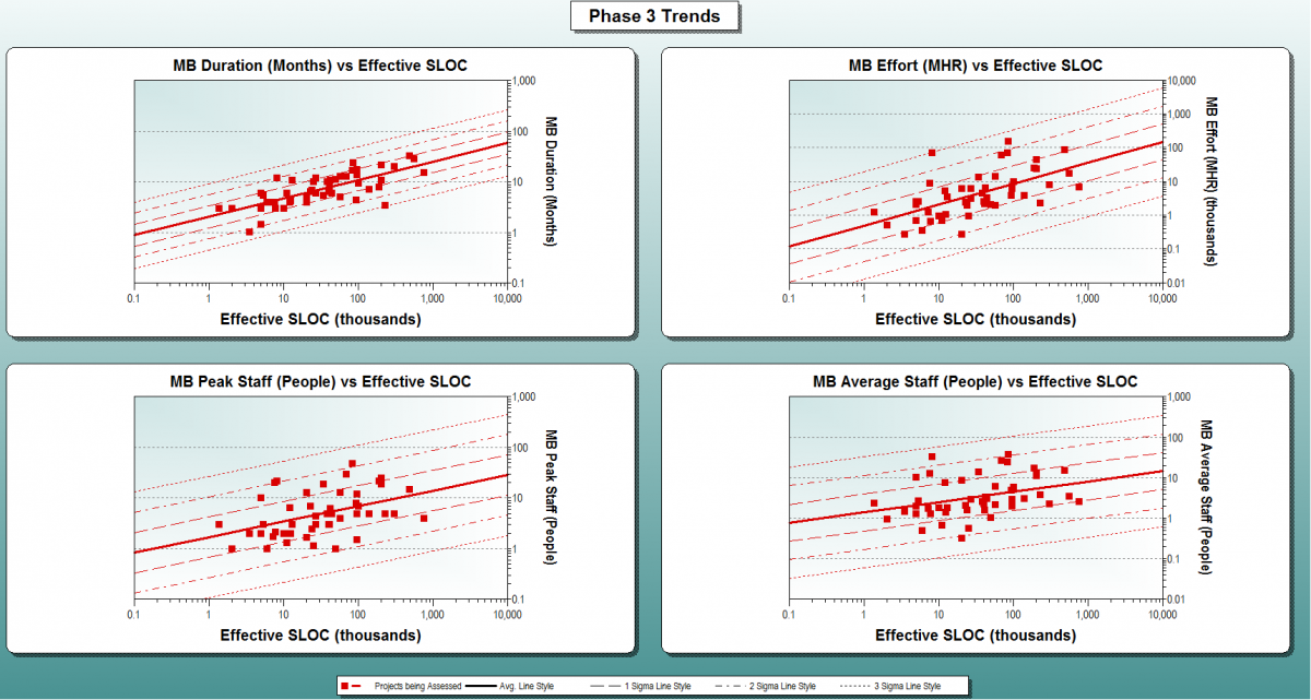
After: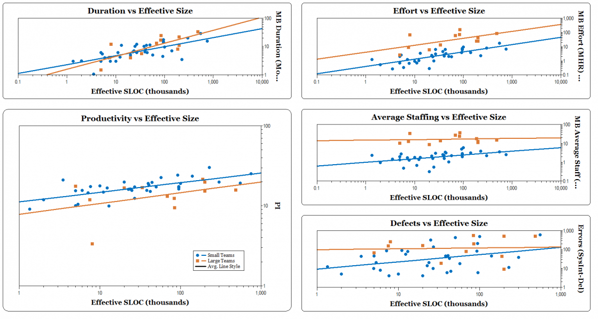
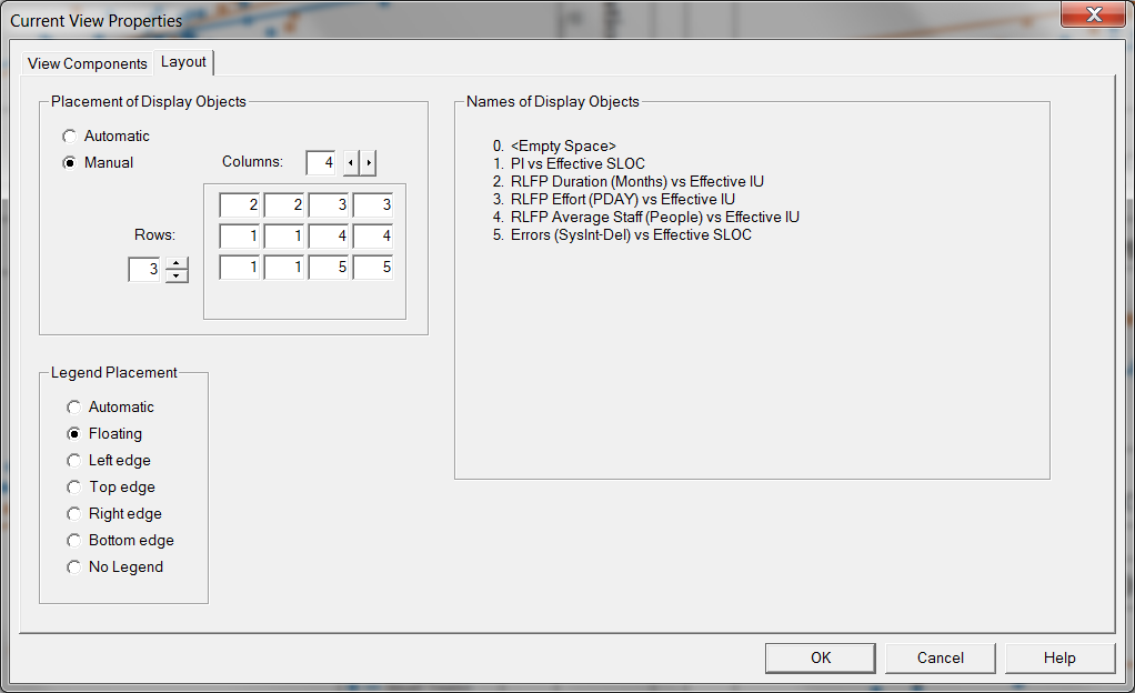
Part of designing a good presentation is highlighting the most important information to support the message you’re trying to convey. In this view, I wanted to show that Small Teams have higher Productivities than Large Teams. I started out by customizing the View Layout (double click on the view title in the Navigation Pane| select the Layout Tab). I did this to emphasize the more important charts by making them larger, or by allocating a greater portion of the grid to that view. I also changed the placement of the legend to Floating by selecting the corresponding radio button.
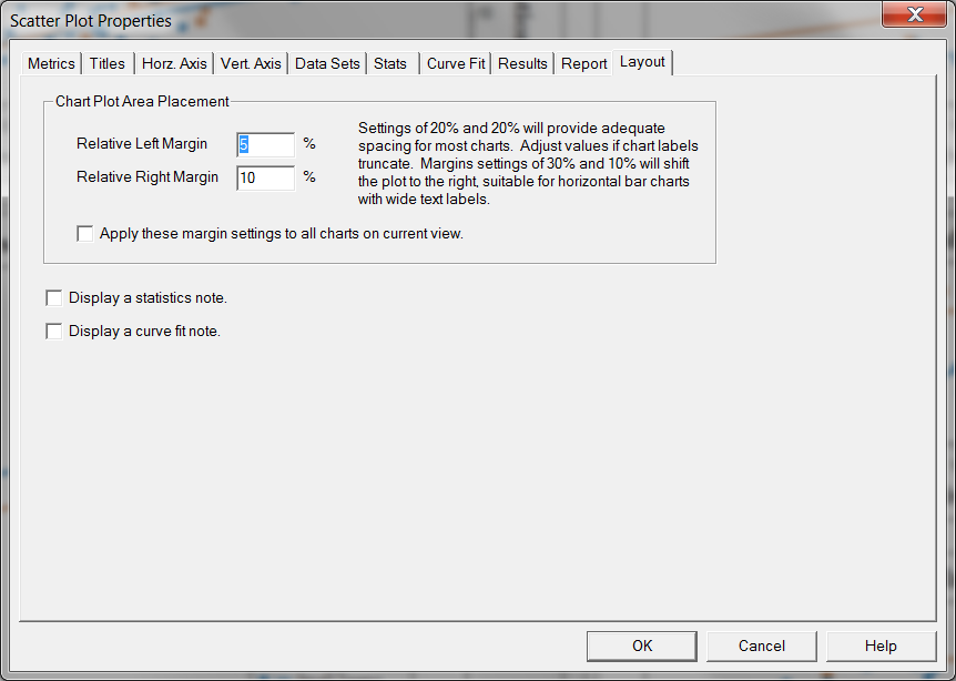
Then I adjusted the margin width to make more effective use of space. In this case, the left margin was 5% and the right margin was 10%. To do this, simply right click on a chart| select the Layout tab on the right| adjust your margin width as desired. You can even apply this setting to all the charts in the view by checking the box.
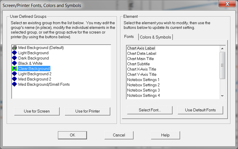
Then I changed the background of the chart to Clear (Tools| Customize Display| Screen/ Printer Fonts, Colors & Symbols) and changed all the Element fonts to Georgia, and made the font color Black.
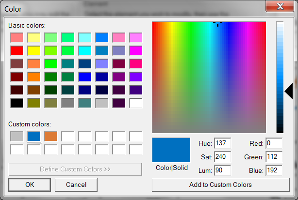
I changed the colors of the various datasets to match the branded QSM colors (Tools| Customize Display| Screen/ Printer Fonts, Colors & Symbols| select the Colors & Symbols tab| select the desired Dataset and click Define Custom Colors| from there enter the corresponding RGB number).
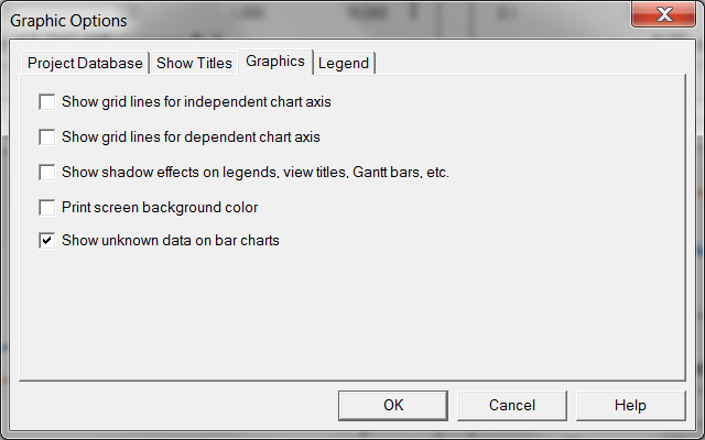
Finally, I customized the graphics display, to remove the shadows around borders and to remove the horizontal gridlines (Tools| Customize Display| Graphic Options.
Once a view has been customized to your liking, you can save the template for future use (instructions here). Customized charts can be more easily inserted into a PowerPoint slide and require less cropping and formatting than charts copied from the Default Views.

I hope this tutorial saves you some time when designing your next presentation, and allows your audience to focus more on the message you're sharing, rather than picking apart the aesthetics of your slide deck.
