- Home
- Frequently Asked Questions
- <GENERAL FAQ>
- Tips & Tricks
- Frequently Asked Questions - Tips & Tricks
Frequently Asked Questions - Tips & Tricks
View the Reports and Graphs Export Table to see the best way to get SLIM-Suite reports and graphs into other applications.
There's a good fit between my total defect data and the plan but in the defects by category charts, the defect actuals for each category aren't tracking the plan very well. How can I fix this?
Chances are your defect category percentages need to be adjusted. To tune these percentages using your actual data, create a Multi-Metric Time Series Chart and insert a QSM Tracked Defects Category Total (Actual) metric for each defect category you're tracking:
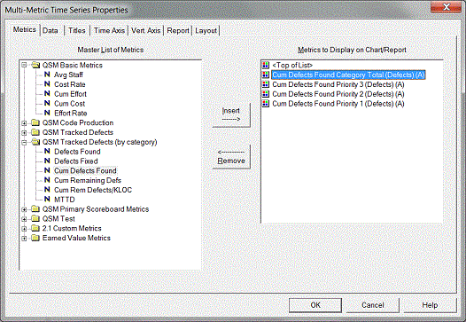
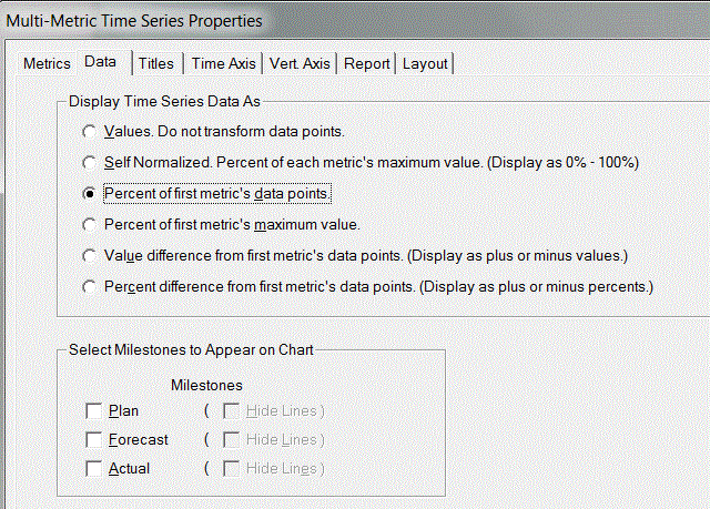
Next, right click on your chart to access the chart property tabs. On the Data tab, select "Percent of first metric's data points" and click OK to exit the dialog.
Next, toggle your Multi-Metric chart into report form:
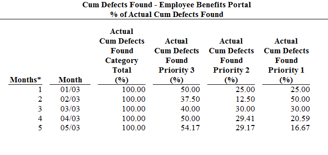
If the weekly or monthly values seem fairly consistent, you can simply use the latest % of total for each category. If you see a lot of variation, you may want to average the values - don't be afraid to experiment until you get the best visual fit! Enter the % for each category on the Reliability tab of the Project Environment dialog:
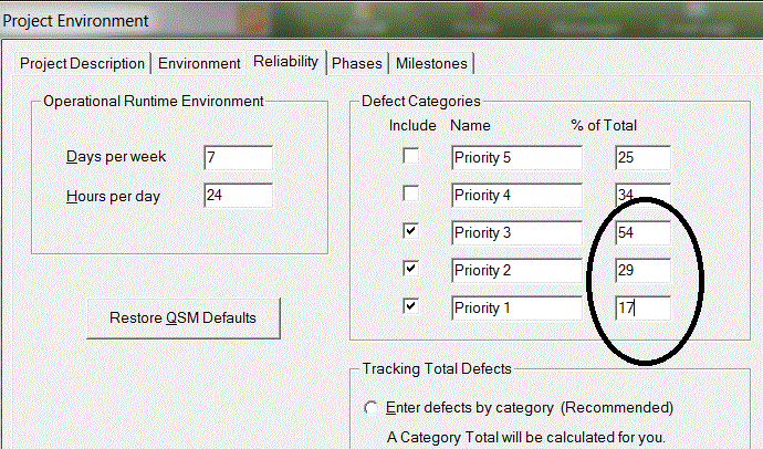
Once you return to the defects by category views, you should see a better fit between the plan and actuals.
The planned MTTD value shown on my graph for the final month of phase 3 is not the same as the value reported in the Project Profile report and the consistency report for my Phase 3 MTTD. It appears to be slightly higher in the reports. Why?
The value displayed on graphs is the average MTTD rate for the final month of phase 3, but the MTTD value reported in the reports represents the planned MTTD at the end of phase 3. You should expect this value to be somewhat higher than the average value for the entire month, because the theoretical MTTD is always improving (getting larger) as time progresses.
Sometimes, one or more of the menu items in SLIM-Control are grayed out and I'm not sure why.
Grayed out menu options generally denote features that will not become available until some condition has been satisfied. Here are some of the most common reasons a menu option may be unavailable:
1. You're trying to edit a QSM Default custom metric or control bound. Since QSM default custom metrics and control bound definitions cannot be edited, the options for these metrics are grayed out. You can, however, copy a QSM default metric or control bound definition and edit the copy.
2. You're trying to enter actual data for a metric that has not started yet or is complete. Before you can enter actual data for a metric, you must first enter an actual start date for that metric. Likewise, once you've entered an actual end date for a metric, you will no longer be able to enter actual data for that metric.
3. You're trying to set a start or end date for a metric that is tied to a phase: Start and end date fields for planned staffing/effort are disabled because staffing and effort data is always tied to a specific phase. For example, phase 2 effort begins on the first day of phase 2 and ends on the last day of phase 2. Start/end dates for each phase are defined on the Phases tab of the Plan property sheet (Control | Plan Data).
Start dates for Defect metrics are customizable, but defect end dates are disabled because they coincide with the end of the life cycle.
4. You're trying to enter a start or end date for an inactive phase. On the Plan | Phases tab, planned start or end dates can only be entered for active phases. To view/edit the active phases for the project, select Tools | Customize Project Environment and select the Phases tab.
When I change the Person Hours per Person Month field in Accounting Options, there is no change to the total schedule and effort for the project. How can I adjust the estimate to reflect overtime?
The person hours/person month field was never intended to be used for performing time/effort tradeoffs. For estimating purposes, SLIM-Estimate assumes that a FTE person is a FTE person, regardless of the number of hours in an effort month. To account for overtime or unusual staffing situations, you should adjust the FTE (full-time equivalent) peak staffing level.
For example, to reflect 10% overtime, you need a peak staff that is 1.1 times the current peak. You can do this using the Control Panel peak staffing dial or by extending or shortening the Phase 3 schedule.
NOTE: if you are using a PI from your completed projects, you should only make this type of adjustment if your history does not include overtime. It is usually better to be conservative in making adjustments as overtime hours are often less productive. If the completed projects you used to derive a PI had a similar amount of overtime, it is already reflected in the PI and no adjustment is needed.
Sometimes the effort data points on my Life Cycle Sensitivity to PI graph have values that do not always increase (or decrease); e.g., there are small dips in the data.
Remember that the time and effort shown on these graphs are life cycle values. The most likely cause of slight variations in the expected behavior of the data is caused by variation in the effort for phase 4. Staffing projections for phase 4 are dependent on the staffing rate at the end of phase 3. Therefore, differences in the final phase 3 staffing rate can result in variations in the total effort for phase 4. You can check to see if this is the case by making the solutions in question the current solution, then comparing the phase 4 effort in the solution panel of the staffing view.
What is the impact of selecting various phase staffing shapes? When should I deviate from the default Rayleigh pattern, and how is my estimate affected?
We have found that the default Rayleigh pattern is the staffing pattern that best matches the application of effort to the work to be performed but due to staffing constraints or different software management styles, you may decide that another staffing pattern fits your organization or project better.
In general, the various staffing shapes can be described as follows:
- Front Load Rayleigh peaks at approximately 40% the phase
- Medium Front Load Rayleigh peaks midway through the phase
- Medium Rear Load Rayleigh peaks at approximately 75% of the phase
- Rear Load Rayleigh (Phase 3 only) peaks at the end of the phase
- Level Load maintains a constant staffing level over the entire phase
- Exponential (Phase 4 only) gives the most rapid drop off of staffing from the end of Phase 3.
- Stair Step (Phase 4 only) begins at about half of the staffing level from the end of Phase 3 and stair steps down.
- Straight Line: (Phase 4 only) represents a straight-line decrease in staffing from the end of Phase 3.
- Rayleigh (Phase 4 only) is a natural tailing off/continuation of any Phase 3 Rayleigh curve. Not valid if the selected Phase 3 staffing shape is Level Load.
Level loading is generally seen in the development of very small systems. In larger systems, early application of people often represents wasted effort. The Default Rayleigh shape determines the staffing shape based on the size of the application. QSM has found that small projects (less than 18,000 lines of code) tend to have a Front Load Rayleigh profile while larger systems (greater than 100,000 lines of code) typically reach peak staffing towards the end of phase 3. For very small systems (3 to 6 months in duration with a peak staff of 1-3 persons), a level load profile is more appropriate.
The estimated total effort for each of the staffing patterns for the first three phases will remain constant regardless of the pattern selected. Phase 4 effort will vary, depending on the shape of phase 3. This is because in phase 4, manpower tails off from the final Phase 3 staffing level and is therefore a function of the number of people on board at the end of phase 3 and the length of phase 4. Projects that peak at the end of Phase 3 will have higher phase 4 effort. Projects that peak earlier will have lower phase 4 effort.
If you are using default QSM overlaps for the phases, you can expect to see some differences in the phase overlap when you change the staffing pattern. This occurs because SLIM attempts to produce the smoothest aggregate staffing pattern when moving from one phase to the next.
For example, the overlap percentage between Phases 2 and 3 will be 0% if Phase 3 is Level Loaded. Otherwise the overlap ratio will range from 33% to 40% as the phase 2 staffing shape changes from Front Load Rayleigh to Medium Front Load Rayleigh.
Is there a limit on the number of projects that can be loaded into SLIM-MasterPlan?
There is no limit to the number of projects you can load into MasterPlan other than what is allowed by the graphics and memory capabilities of your PC. But if your MasterPlan workbook includes an unusually large number of projects it may be difficult to see all the projects clearly on graphs.
Here are some suggestions for MasterPlan files with a large number of projects:
- Place a single graph on each view to allow more room for MasterPlan to display the projects onscreen.
- Use the Level of Detail tab in Gantt Chart Properties to adjust the number of levels shown
- Group your projects by category, perhaps by division, year, budget, or program to make your MasterPlan estimates more meaningful
- Consider moving projects which are more similar to iterations to SLIM-Estimate as a Work Breakdown Structure (WBS)
In SLIM-Suite, some dialog boxes are too large for my screen. What is the recommended screen resolution?
If you are running at a low screen resolution, certain dialog boxes may not fit within the screen display.
The recommended screen resolution is 1024 x 768 with 256 colors and 96 dpi (default small fonts). For optimal graphics display when running SLIM tools, the screen resolution should be set to at least 800 by 600 for small fonts (or at a higher resolution if you are using large fonts).
My graph titles are being truncated in SLIM-Suite. Is there a way to fix this so that I can keep my chart title?
If a chart title or chart axis label is too long to fit in the allotted space, SLIM-Suite applications will truncate the text instead of wrapping to the next line. This happens on all QSM charts. There are a few options in this case:
- Reduce the font size.
- Shorten the title by cutting out words or using abbreviations.
- Maximize the display window.
- If the appearance is acceptable on printouts, leave the title as is.
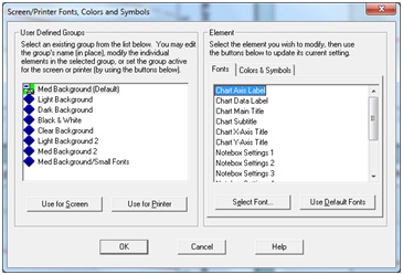
To reduce the font size, select Tools | Customize Display | Screen/Printer Fonts, Colors, & Symbols. On the Element side of the dialog box, select the desired chart title or label and click the Select Font… button to reduce the font size.
