Having data is great, but if you don't understand how to display it, you can't get your point across. The focus of this blog series is to explain the various chart types available to you in SLIM-Metrics so that you can efficiently analyze your data, as well as to provide helpful tips and tricks.
Bar charts break a data set into bins or categories and provide the number/percent of projects or the average metric value for each category.
Unlike scatter plot charts, bar charts can display both numeric and text metrics. There are two metrics tabs on a bar chart property sheet — one for the independent and one for the dependent metric. To create a bar chart, highlight the independent and dependent metric you want to display and select Choose, or simply double-click the desired metric. Once chosen, the selected metric name appears in the field to the right of the Choose button.
Histograms

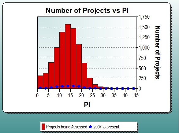
Histograms display continuous numeric data (each bar spans the interval between dependent axis ticks) grouped into evenly spaced bins on the independent axis, for the first data set. Additional data sets are overlaid over the bars in a line style with symbols. The Bin Size or Number of Bins can be customized, or you can select Auto to accept the default bin settings.
Histograms show both values and distributions, which is an important way of evaluating single summary statistics, such as averages. For example, if a PI histogram follows a normal distribution, then you can probably use the average PI for estimation. If a PI histogram does not follow a normal distribution, then it is a good idea to choose a different method to pick PI.
Bar Chart

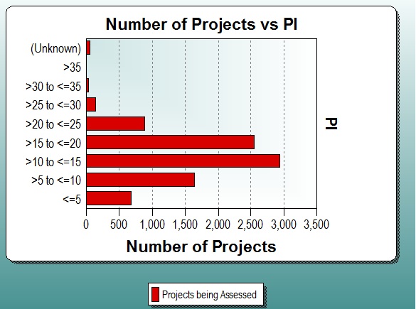
Bar charts display data as horizontal bars. More than one data set will be shown in a clustered bar format. You can customize the bar chart category ranges and labels or accept the default settings.
You can change the orientation of the bars by right clicking on the chart and accessing the Independent Axis tab and selecting the desired radio button in the Orientation box.
Column Chart

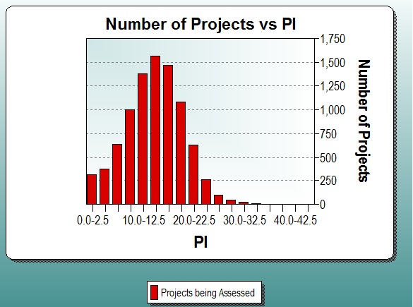
Column charts display numeric data as columns, with a space between each column. More than one data set will be shown in a clustered bar format. The Bin Size or Number of Bins can be customized, or you can select Auto to accept the default settings.
Analyzing Bar Charts and Histograms
There are a couple of things you should look for when analyzing bar charts and histograms. You should look at what the shortest and tallest bars are as well as the size of the bars are (is one bar very tall or are all the bars roughly the same size?). Pay attention to the axes and make sure that if you are analyzing two bar charts for the same data set, they both have the same axes labeling.
When analyzing multiple bar charts or histograms on the same view, make sure that the intervals are the same for all bar charts so that you're telling the same "story." For example, if you have a bar chart for the number of projects developed in time buckets that run 1990 to 1994, 1995 to 1999, 2000 to 2004, and so on in one bar chart, the other bar charts on the view should have the same set up. Make sure that unit labels are consistent across the view (all the charts use Phase 3 effort in person months instead of a mix of person hours or person days).
Benefits of Bar Charts and Histograms
One great feature of bar charts and histograms is that they can display numeric or text metrics. Use text metrics as the independent metric in order to view the distribution or use text metrics to visualize the makeup of your database by selecting the text metric for both the independent and dependent metric and make sure the Counts radio button is selected.
Drawbacks of Bar Charts and Histograms

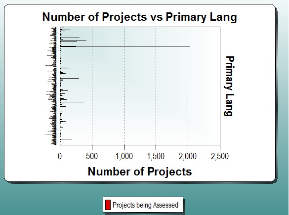
A possible drawback of bar charts and histograms is that you cannot have too many different numeric or text metrics on a bar chart, as shown in the image above. For example, it is not a good idea to have a bar chart for programming languages if your data set contains 200 different languages. If you wanted to show a bar chart for programming languages in your data set, you should break out your query so that you have fewer languages on the chart, but more charts in your view in order to show all the programming languages. Alternately, you could toggle the chart to report form in order to view the number of records for each programming language.
