SLIM-Metrics

SLIM-Metrics

How to Use Big Data to Improve Your Software Projects

In the recent Washington Post article How the Obama Campaign Won the Race for Voter Data, Joel Kowsky writes about how the 2012 Obama campaign used analytics to improve their campaign strategy, and to ultimately secure the presidential victory.  

Regardless of where you stand on the political spectrum, it’s hard to argue that Barack Obama’s campaign strategy was anything short of impressive.  As soon as Obama took office in 2009, his team began preparing for his 2012 campaign.  From the start there was a strong emphasis on measuring the campaign’s progress.  Jim Messina, Obama’s 2012 campaign manager, stated 

“There’s always been two campaigns since the Internet was invented, the campaign online and the campaign on the doors.  What I wanted was, I didn’t care where you organized, what time you organized, how you organized, as long as I could track it, I can measure it, and I can encourage you to do more of it.”

The team began by conducting a postmortem study on their 2008 campaign where they analyzed the number of homes visited, phone calls placed, and voters registered by each field organizer and volunteer.  The result was a 500 page report which highlighted areas of improvement for the 2012 campaign.  

The suggestions led the Obama campaign to invest in building customized software that would integrate all the data the campaign had collected on voters, donors, and volunteers and link to individual voter profile.  This software analyzed previously collected data to calculate the likelihood of candidate support, the likelihood of election day turnout, and the degree of persuasion for each voter.  

Customizing SLIM Suite Workbooks

Although each workbook is set up with default themes, the look and feel of SLIM-Estimate, SLIM-Control, SLIM-Metrics, and SLIM-MasterPlan workbooks are readily customizable.  

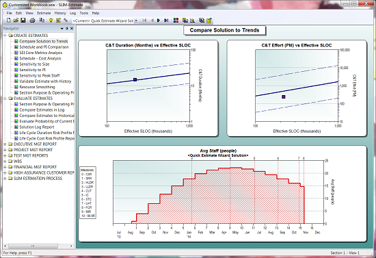
Default workbook settings

Screen Background

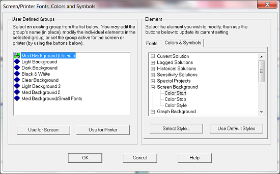
The easiest way to change the feel of your workbooks is to change the background color and style.  To change the background color, go to Tools|Customize Display|Screen/Printer Fonts, Colors, and Symbols…, then go to the Colors & Symbols tab on the right.

Screen/Printer Fonts, Colors, and Symbols

Color Start and Color End are important if you want to create a gradient background, like the background in the first image.  A gradient background begins with your specified Color Start color then transforms into your Color Stop color either vertically, horizontally, or diagonally (pictured above).  If you choose the Solid color style, simply select your Color Start.

Graph Background

Like the Screen Background, you can have a solid background or a gradient.  Simply follow the steps above for selecting your colors and styles.

Solutions and Reference Data

Database Validation Best Practices

Database validation is an important step in ensuring that you have quality data in your historical database.  I've talked before about the importance of collecting project data and what you can do with your own data, but it all hinges on having thoroughly vetted project history.

Although it's nice to have every tab in SLIM-DataManager filled out, we really only need three key pieces of information to calculate PI:

  • Size (Function Unit): if the function unit is not SLOC, a gearing factor should be provided (97.3% of projects in the database report total size)
  • Phase 3 duration or start and end dates (99.9% of projects in the database report phase 3 duration)
  • Phase 3 effort (99.9% of projects in the database report phase 3 effort)

These fields can be thought of as the desired minimum information needed, but even if one is missing, you may not want to delete the project from the database. A project that is missing effort data, for instance, will not have a PI but could be used to query a subset of projects for average duration by size. Likewise, a project with no size will not have a PI, but does contain effort and duration information that could be useful for calculating the average time to market for a division. However, if possible, it is a good idea to fill out at least these three fields.

Blog Post Categories 
SLIM-Metrics Data SLIM-DataManager Database

What's the Story in Your Data?

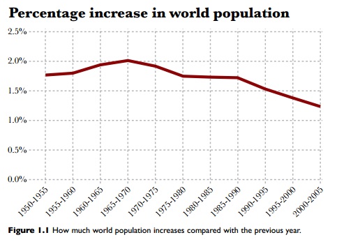
In his book, The Functional Art, Alberto Cairo sets out to explain what data visualizations are, why it is significant to pair data and design, and how to assess whether a data visualization is "good" or not.  In the first chapter, Cairo presents an example from Matt Ridley's book, The Rational Optimist: How Prosperity Evolves.  Ridley asserted that the global population was decreasing over time, using only one line chart.

Percentage Increase in World Population


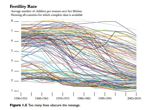
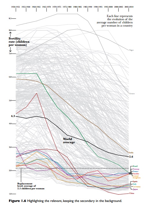
Cairo  was uncomfortable with that assertion, so he used the UN and World Bank data for fertility rates (the average number of children born to a women in each country) to create a graph that used individual country population data instead of using aggregate data.  The chart below shows all the fertility rates for every country over time.

Fertility Rate

There are so many stories in the data that it's overwhelming, so Cairo created the following graphic which highlights just a few countries in order to pull out the story within the data:

Figure 1.6 Highlighting the relevant, keeping the secondary in the background

Blog Post Categories 
SLIM-Metrics Data

All About Bar Charts and Histograms

Having data is great, but if you don't understand how to display it, you can't get your point across.  The focus of this blog series is to explain the various chart types available to you in SLIM-Metrics so that you can efficiently analyze your data, as well as to provide helpful tips and tricks. 

Bar charts break a data set into bins or categories and provide the number/percent of projects or the average metric value for each category.

Unlike scatter plot charts, bar charts can display both numeric and text metrics. There are two metrics tabs on a bar chart property sheet — one for the independent and one for the dependent metric. To create a bar chart, highlight the independent and dependent metric you want to display and select Choose, or simply double-click the desired metric. Once chosen, the selected metric name appears in the field to the right of the Choose button. 

Histograms

Histogram

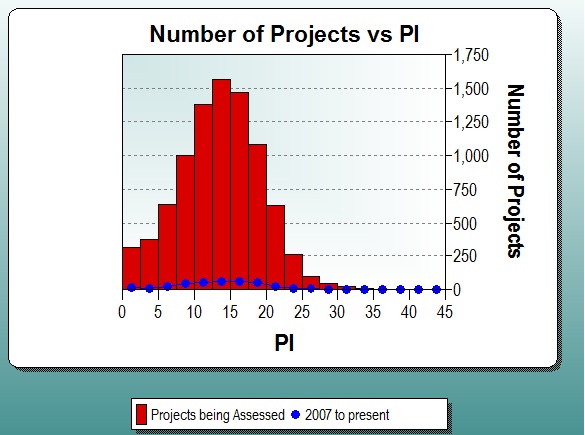
Histograms display continuous numeric data (each bar spans the interval between dependent axis ticks) grouped into evenly spaced bins on the independent axis, for the first data set. Additional data sets are overlaid over the bars in a line style with symbols. The Bin Size or Number of Bins can be customized, or you can select Auto to accept the default bin settings.

Histograms show both values and distributions, which is an important way of evaluating single summary statistics, such as averages.  For example, if a PI histogram follows a normal distribution, then you can probably use the average PI for estimation.  If a PI histogram does not follow a normal distribution, then it is a good idea to choose a different method to pick PI.

Blog Post Categories 
SLIM-Metrics Tips & Tricks

Data Myths

In a post for The Guardian's Datablog, Jonathan Grey explores the rise of data journalism. Data journalism is "a journalistic process based on analyzing and filtering large data sets for the purpose of creating a new story. Data-driven journalism deals with open data that is freely available online and analyzed with open source tools. 

Although data is a powerful tool, Grey reminds readers that it's not a silver bullet and counters some commonly held data myths. 

Data is not a perfect reflection of the world.

Blog Post Categories 
SLIM-Metrics Data SLIM-DataManager

Agile Series Part 2: Stakeholder Satisfaction

When learning something new, people often try to relate the new information back to something they already know in order to help make sense of the new concept or idea.  As a psychology major now working in the software world, I’ve found myself relating a lot of what I’m learning back to the psychological theories and concepts I learned in college.  Therefore, it is no surprise that upon reading The Twelve Principles of Agile Software, I’ve discovered that many of their principles map to organizational psych concepts.

Agile development theory approaches software development holistically.  I believe this is one of the reasons Agile projects have become so successful.  Rather than merely focusing on skill development, Agile methods foster leadership skills and teamwork among members of the development team itself, as well as between the development team, the project owner, and the stakeholders.  One avenue for this is to unify the development team and project owner with the common goal of achieving stakeholder satisfaction.

The first principle states, “Our highest priority is to satisfy the customer through early and continuous delivery of valuable software.”  The question I had upon reading this was what do the authors mean by the term satisfaction?  When thinking about satisfaction, most people think of outcome satisfaction, or the ultimate outcome of something, in this case the functionality of the delivered software project.  Process satisfaction on the other hand, refers to the level of satisfaction associated with the method of developing the software, or how much the stakeholders enjoy the software development process.

Improve Your Project Comparisons

Here is a helpful tip for comparing project performance for projects of different sizes.

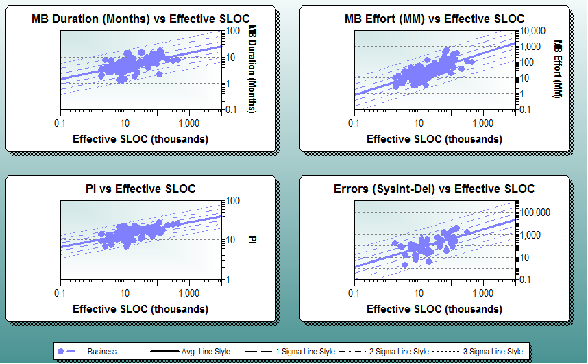
Software size has a big impact on metrics like effort, duration, defects, or productivity. We have known for many years that the relationship between project size and most software metrics is exponential. That is why our trends appear straight on a log – log scale.  SLIM Suite tools take project size into account by regressing core software metrics like effort, duration, or productivity against size to sanity-check estimates and benchmark completed projects:

SLIM standard deviation trend lines

The charts above show both the average trend and +/- 1, 2, and 3 standard deviation trend lines.  As a rule of thumb, a normal distribution (or one that has been normalized by transformation such as our log scale) will typically contain 68% of the data between +/- 1 standard deviation of the mean, 95% within +/- 2 standard deviations, and 99.7% within +/- 3 standard deviations.

Information about the standard deviation can be useful when analyzing software metrics, and it is quite easy to produce in SLIM-Metrics. Starting with a database of SLIM-DataManager projects, you can get a table of the standard deviations using SLIM-Metrics’ five star reports.

Here is a five star report for a set of Command & Control (C&C) software projects.

Blog Post Categories 
SLIM-Metrics Tips & Tricks

Top 25 Programming Languages Visualized

Top 25 Programming Languages

Since I began working with SLIM-Metrics and the QSM historical database, I've been interested in unique ways to present information.  I've written before about how others pair data and design to visualize patterns, but this is my first attempt: a word cloud.  

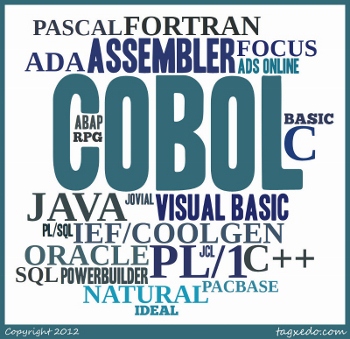
A word cloud is a graphical representation of how often a word is used within a sample.  The larger the font in the word cloud, the more often it is used in the sample.  Word clouds are a great tool for displaying sensitive data without having to use numbers.  The above word cloud visualizes the entire QSM database, going back three decades.

What I like about this visualization is that at a glance, you can tell that more projects use PL/1 than Natural, simply by examining font size.  Even without knowing exactly how many Java projects are in the QSM database, you can still determine that it's more than Visual Basic, but less than COBOL. 

Unsurprisingly, COBOL still has a large market share in the QSM database.  Most COBOL projects completed after 2000 were maintenance projects, not new development. 

Blog Post Categories 
SLIM-Metrics Languages QSM Database

Data is the New Soil

David McCandless gave a TED talk  in July 2010 that focused on pairing data and design to help visualize patterns.  In his talk, McCandless takes subsets of data (Facebook status updates, spending, global media panic, etc.) and creates diagrams which expose interesting patterns and trends that you wouldn't think would exist.  Although the focus of McCandless' talk was about how to effectively use design to present complex information in a simple way, I was struck by his own claim that data is not the new oil, but rather that data is the new soil.  For QSM, this is certainly true!

QSM maintains a database of over 10,000 projects with which we are able to grow a jungle of ideas, from trend lines to queries about which programming languages result in the highest PIs.  With  the amount of soil that we have, we are able to provide insight into the world of software, just with the data that is graciously provided by our clients.  By collecting your own historical data in SLIM-DataManager, you can create your own trend lines in SLIM-Metrics to use in SLIM-Estimate and SLIM-Control, analyze your own data in SLIM-Metrics, tune your defect category percentages and calculate your own PI based on experience in SLIM-Estimate, and much, much more.