Webinar - Function Point Analysis Over the Years
We are pleased to announce our upcoming webinar, Function Point Analysis Over the Years, presented by Don Beckett on Thursday, Dec. 5 at 1:00 PM EST.
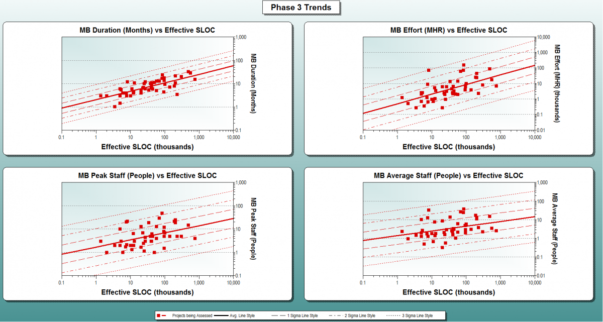
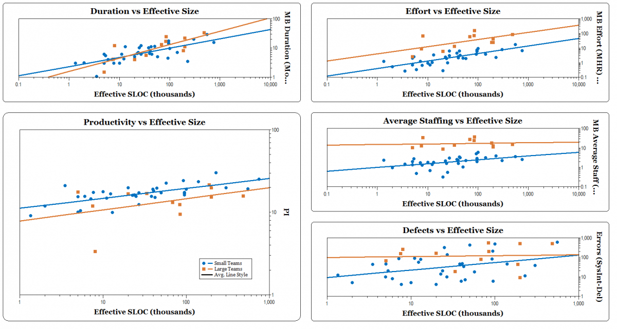
Function point analysis has played an important role in software measurement and analysis for 30 years. What can we learn from trends spanning this substantial time period? What does the "average software project" look like? Has productivity increased or decreased? What are the impacts of different staffing strategies? In this webinar, QSM's Don Beckett leverages more than 2,200 validated projects counted in function points and completed since the year 2000 from the QSM historical database to answer these questions. It is easy to have opinions about any of these questions. QSM is fortunate to be able to evaluate them empirically. Please join us for a metrics-based analysis of these questions and more.
Don Beckett has 18 years of experience in software project estimation, measurement, and analysis. His responsibilities at QSM include research, consulting, and customer support. Don was an analyst/co-author of the 2006 QSM Software Almanac and has contributed articles to Crosstalk and Software Tech News.


