Having data is great, but if you don't understand how to display it, you can't get your point across. The focus of this blog series is to explain the various chart types available to you in SLIM-Metrics so that you can efficiently analyze your data, as well as to provide helpful tips and tricks.
Bar charts break a data set into bins or categories and provide the number/percent of projects or the average metric value for each category.
Unlike scatter plot charts, bar charts can display both numeric and text metrics. There are two metrics tabs on a bar chart property sheet — one for the independent and one for the dependent metric. To create a bar chart, highlight the independent and dependent metric you want to display and select Choose, or simply double-click the desired metric. Once chosen, the selected metric name appears in the field to the right of the Choose button.
Histograms

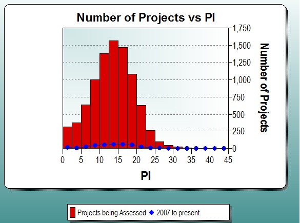
Histograms display continuous numeric data (each bar spans the interval between dependent axis ticks) grouped into evenly spaced bins on the independent axis, for the first data set. Additional data sets are overlaid over the bars in a line style with symbols. The Bin Size or Number of Bins can be customized, or you can select Auto to accept the default bin settings.
Histograms show both values and distributions, which is an important way of evaluating single summary statistics, such as averages. For example, if a PI histogram follows a normal distribution, then you can probably use the average PI for estimation. If a PI histogram does not follow a normal distribution, then it is a good idea to choose a different method to pick PI.

